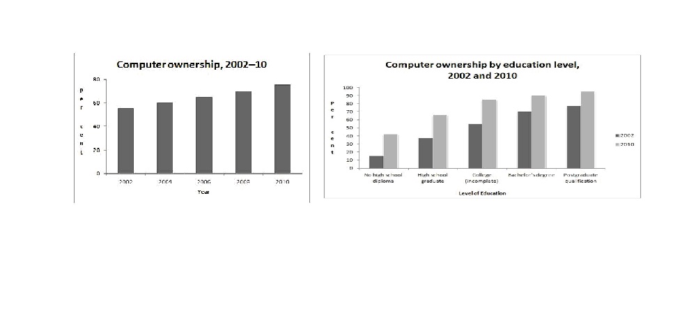
The graphs show information about computer ownership as a percentage of the population between 2002 and 2010, and by level of education for the years 2002 and 2010.
In general, it can be seen from the graph that percentage from computer ownership and level of education which have different every years.
The first graph, in 2002, computer ownership was approximately 55 percent, and increased slightly almost 60 percent in 2004. From 2006, it began to increase steadily just above 65 percent, despite a slight rise in 2008 approximately 67 percent, and climbed ever higher to almost 70 percent in 2010. With the result, computer ownership from year 2002 until 2010 has undergone increasing step by step every year.
The second graph, education level is consisting of several levels by computer ownership from 2010 until 2010. For example, no high school diploma has approximately 18%, it began to increase slightly almost 38% in around high school graduate, continued to rise steadily in college among 52%. Afterwards, it climbed even higher to almost 68 % in bachelor's degree, and rose sharply in postgraduate qualification approximately 72 %. However, in 2010, computer ownership by education level was different in 2002 which was computer ownership higher than in 2002.
To sum up, it can be concluded that computer ownership in years 2010 had percent higher than in year 2002 until 2008. Then, computer ownership by level education had different percent between level which was higher postgraduate qualification in 2002 and 2010 than other levels, and no high school diploma was fewest than others.

computer_ownership.j.jpg
