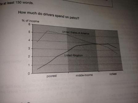
The line graph provides information regarding the amount of petrol spent people in two different countries and it is measured in the percentage of income. Overall, what stands out from the graph shows that poorest and middle-income in USA spent more income on petrol than those was in UK. However, in UK richest people used much more money for petrol instead of USA's richest individuals.
In detail, in USA poorest persons spent far much income on petrol than those was in the same country who had other income and was in UK. In contrast, the gap between middle-income of people in USA and UK allocating budgets for petrol saw narrowed considerably.
A closer look at the data reveals that more richest people in UK took income to consume petrol than USA's. Although both those in these countries had parallel downward trend in consuming petrol, UK's wealthiest people was more than USA'.

IMG_0294.JPG
