households owning and renting accommodation
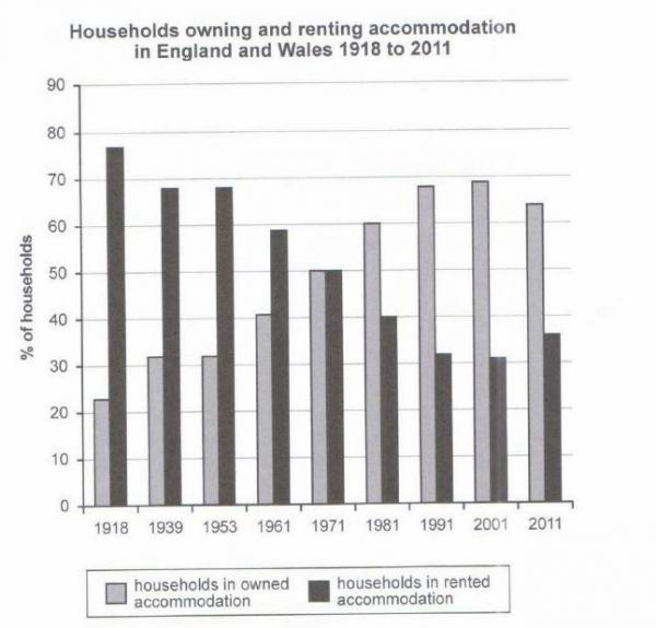
The chart shows the percentage of households in owned and rented accommodation in England and Wales between 1918 and 2011.
Summarise the information by selecting and reporting the main features, and make comparison where relevant.
The diagram indicates the comparison of households in owned and rented residence in England and Wales between 1918 and 2011.
Overall, the percentage of households owning accommodation goes upward, but those renting homes goes in the opposite way. In 1971, people who owned and rented houses had an equal proportions.
Before 1971, dwellers who rented residence has a higher percentage than those who owned. In 1918, we can see that families living in rented homes had overtook almost 60% from people living in owned. The rented trend goes downward, but the households-in-owned trend raised. 1971 remarks the point at which households in owned and rented had a same percentage.
After 1971, the trend totally differed from the earlier time. The percentage of people who owned their house increased while households in rented dwellings slumped. Comparing families owned accommodation with rented, owned house raise slightly by 5%, and a corresponding fell in rented homes between 2001 and 2011. The biggest difference in percentage of owning and renting accommodation was in 2001, which owning houses was 38% higher.

w2.jpg
