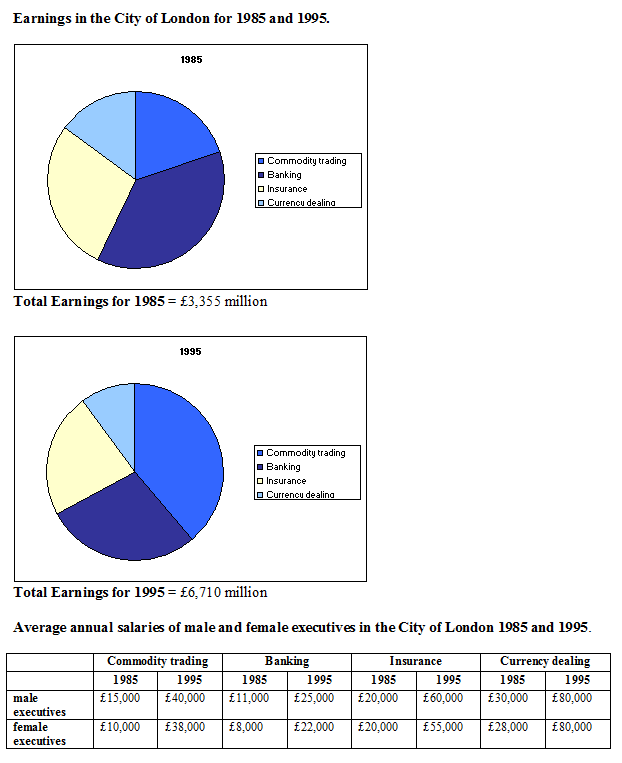
The pie chart below shows the earning of the City of London for the years 1985 and 1995. These earnings are known as invisible earnings and they showed huge increases in the years studied. The graph shows comparisons between earings for male and female executive in the various financial sectors for the same years.
The pie chart informs percentage income of four categories, while the graph gives the data average annual income of man and woman in the City of London during 10 years, from 1985 and 1995.
Overall, the amount of city's income and executives' salaries had a dramatic rise in the each sector from 1985 to 1995.
In the 1985, a consideration which was improving city's income was insurance sector, also executives who worked in insurance company gained the second position. Moreover, trade areas placed in the third higher position which contributed earning in the City of London and brought salaries for managerial levels. However, the overall growth of income between City of London and executive had more doubled amount of income in last period between 1985 and 1995.
Having said that, in the 1995, trading was being the first sector which provided the highest income for London and 3 sectors followed which were banking in the second, insurance in the third and currency dealing in the last position. As such, the reverse ordering categories with annual salaries of male and female executive in London where currency dealing company gave highest salary for their executive followed by insurance sector in the second place, and banking and trade in the third and fourth position. In the 1985, bank gave the highest income for city, while banking paid their executives with the lowest average annual salaries and reversed condition with currency dealing.

earning_money.png
