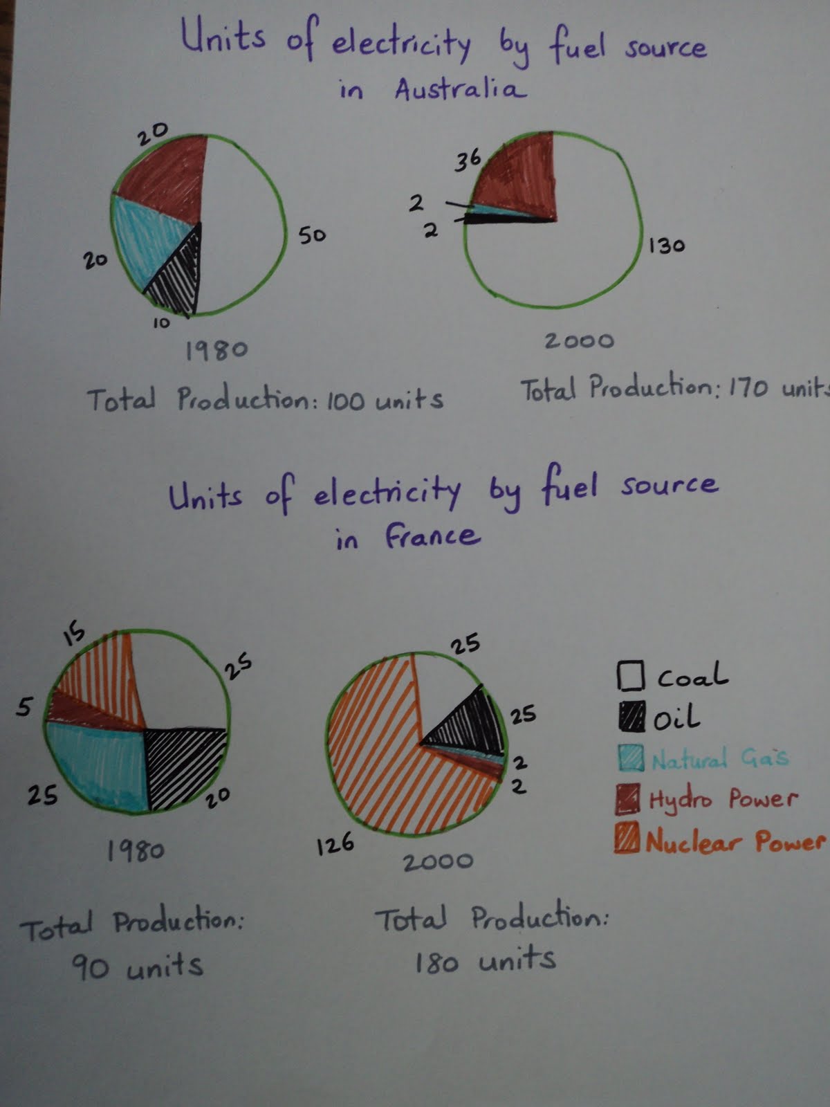
The pie charts illustrates the total electricity's number in Australia and France in the field of fuel source over a 20 year from 1980 to 2000.
Overall, total electricity production in both countries increase dramatically, while France' production doubled over a period of 20 years, Australia reckoned 70 % increase of the total production. Besides, the electricity sources were different in both countries under review.
As per the pie charts, coal production in Australia increased noticeably from 50 to 130 units. In comparison with the similar electricity source in France being accounted with 25 percent in both statistic' year, such trend showed a 80 percent increase. Similarly, hydro power in Australia rose around 16 percent while nuclear power in France had almost ninefold increase in full loan of electricity support. Standing in contrast, the electricity sourcing from natural gas of both countries decreased sharply. Australia experienced 18 percent reductions from 20 units in 1980 to just 2 units in 2000 while France showed a larger 23 percent reduction from 25 to 2 units over 20 years under review.
A more detailed look at the pie charts revealed that the overall changes in percentages in Australia and France was not always similar. While the Australia's oil production experience a two-fifth decline, from 10 to 2 units, such production in France raised 5 percent increase over the measurement. However, it is obvious that the larger of total electricity production in France was supported by the immense growth of nuclear power whereas did not occurred in the Australia charts.

image_of_australian_.jpg
