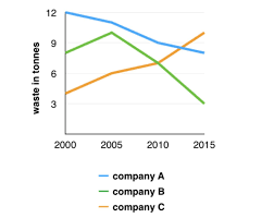
the amounts of waste produced by three companies over a period of 15 years.
The given line graph compares the quantities of three companies' waste output for 15 years, spanning a period from 2000 to 2015. The unit is measured in tonnes.
Overall, there were significant changes in the amount of waste generated by all three companies depicted on the graph. Companies A and B saw a decrease in waste material, whereas the waste production of Company C rising remarkably.
Company A ranked first in 2000 with 12 tonnes of waste material, followed by Companies B and C with nearly 8 tonnes and approximately 4 tonnes, respectively. Over the subsequent 5 years, the figures for both Companies B and C increased steadily to around 2 tonnes while the waste produced by Company A displayed a downward trend on the graph.
During the next 10 years, only Company C saw a continuous rise in terms of waste generation. In contrast, after reaching a peak at 10 tonnes, Company B's waste output sharply declined to the lowest point. By 2015, Company C's waste material had risen to 10 tonnes and had taken over the first placement from Company A; while the amount of waste produced by Companies A and B had fallen to 8 tonnes and 3 tonnes, respectively.

download.png
