Unanswered [1]
  

Home / Writing Feedback   % width   Posts: 2


The graph gives information about drinking habits in the US by age.


hoangmyvo 2 / 3  
Jul 12, 2017   #1

alcohol use in the usa


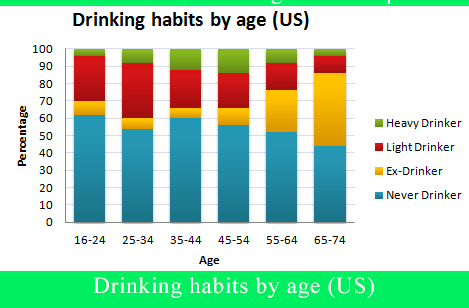
The bar chart above presents the information about people's drinking behavior by age group in the US.
Accordingly, the highest proportion of those who never drink falls into 16-24 years group. However, this number tended to decrease with age. Only 45% of people who turned to age 74 had never drunk.

On the other hand, the percentage of those who had quitted drinking tended to increase with age. Only 5% of the youngest age group were ex-drinker, compared with 40% of the oldest age group.

People in the age of 25 to 34 had the most number of light drinkers, accounting for 30% of the total. The middle age group (45-54) was supposed to be the heaviest drinkers, amounting to 14%. A relatively small proportion of those in the youngest age group and even smaller number in the oldest age group (roughly 3%) drink heavily.

  • barchart1.png


Holt  Educational Consultant - / 15512  
Jul 12, 2017   #2
Hoang, you are not properly summarizing the information referred to you for reference in the graph. Aside from identifying the type of graph in the illustration, you need to complete your summary outline by referring to the specific overview information that was provided. A sample summary overview for this essay is as follows:

The bar chart illustrates the drinking habits by age of US drinkers. The percentage and age of drinkers are indicated in the chart. Additionally, the type of drinkers has also been noted for reference. The following paragraphs will break down the chart information for comparison purposes.

Note that my sample follows the mandatory minimum of 3 sentences which indicates a full paragraph. You should have combined your second and third paragraph information in order to meet the minimum sentence requirement per paragraph since the information you presented is related. Overall though, you did a pretty good job of offering the most obvious information in the bar chart. There is no right or wrong way of analyzing the chart. What is important is that you can clearly explain the contents of the chart to the reader and I believe that you did exactly that, with a few mistakes as noted above.


Home / Writing Feedback / The graph gives information about drinking habits in the US by age.
ⓘ Need Writing or Editing Help?
Fill out one of these forms for professional help:

Best Writing Service:
CustomPapers form ◳

Graduate Writing / Editing:
GraduateWriter form ◳

Excellence in Editing:
Rose Editing ◳

AI-Paper Rewriting:
Robot Rewrite ◳