Unanswered [2] | Urgent [0]
  

Home / Writing Feedback   % width   Posts: 2


IELTS 1: the percentage breakdown in the spending patterns of Japanese and Malaysian families - 2010


Ptp03 4 / 6  
Jun 15, 2020   #1

Comparing household expenditures in two countries


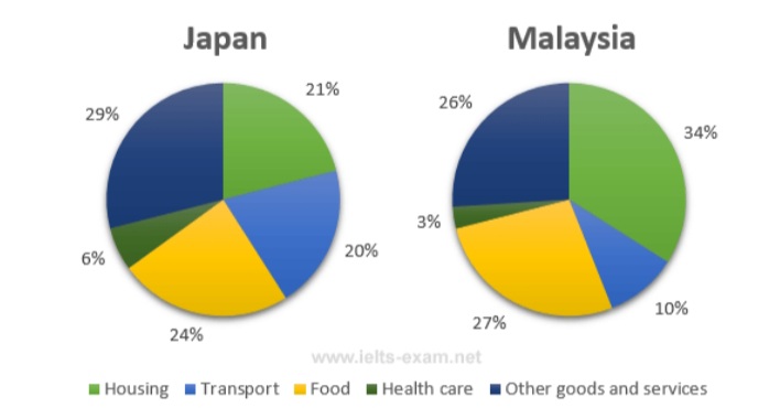
Writing: The pie charts below show the average household expenditures in Japan and Malaysia in the year 2010.

The two pie charts illustrate the percentage breakdown in the spending patterns of Japanese and Malaysian families in 2010.
Concerning Japan, a typical family spent the lowest amount of money on healthcare with an insignificant portion of 4%. Housing and transport, both accounted one- fifth of Japanese household expenditure, while the figure for food was slightly higher, at 24%. The largest proportion of money was allocated for other goods and services, at 29%.

When it comes to Malaysia, a similar pattern can be witnessed when a Malaysian household spared a tiny part of their budget for healthcare (3%), but substantial portions of more than a quarter for food and other goods and services. However, compared to Japan, the accommodation expense represented a much higher percentage (34%), meanwhile, the proportion for transport was much lower, only 10%.

Overall, both Malaysia and Japan spent significantly on food, housing and other goods and services in 2010. It is also noticed that the spending pattern of a Japanese family was more evenly split compared to a Malaysian one.

(174 words)

  • 20200615_210324.jpg


Holt  Educational Consultant - / 15384  
Jun 16, 2020   #2
You did good work in presenting the information based on the pie charts. You were smart to keep it direct to the point. Using the actual figures will also help show clarity and coherence in your presentation of data. However, the summary overview you presented was simply incomplete. The missing information include:

- The type of measurement used (percentage)
- The measurement basis (Housing, transport etc.) must also be outlined in the summary

These additional 2 sentences would have helped you achieve the 3 sentence minimum per paragraph. It would have also shown how the discussion would have progressed per country. It would have been nice to see some comparison points between the two countries as these provide an idea to the examiner as to how well you scrutinized or analyzed the content of the pie charts in relation to its relevance to the countries provided. Was there any connecting information? Any similarities? You could have indicated something like "Malaysia and Japan showed similar spending considerations for housing. Both spent the least in the housing section at 6 and 3 percent respectively", or something similar.

Overall though, this was pretty good work. It was refreshing to see a trending statement at the end of the essay. It created a positive variation for your data presentation. Everyone else places it as a part of the overview although, it could be located within any part of the essay. By placing the trend at the end, you created an interesting method of closing the discussion. It seems less abrupt than the average presentation.


Home / Writing Feedback / IELTS 1: the percentage breakdown in the spending patterns of Japanese and Malaysian families - 2010
Do You Need
Academic Writing
or Editing Help?
Fill out one of these forms:

Graduate Writing / Editing:
GraduateWriter form ◳

Best Essay Service:
CustomPapers form ◳

Excellence in Editing:
Rose Editing ◳

AI-Paper Rewriting:
Robot Rewrite ◳

Academic AI Writer:
Custom AI Writer ◳