Summarise the information from the chart
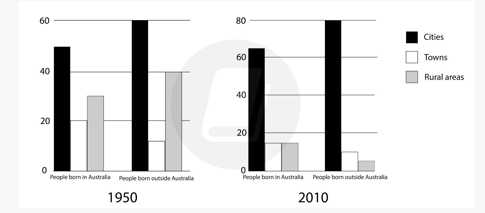
The chart below shows the percentage of people born in and outside of Australia living in cities, towns, and rural areas in 1950 and 2010.
Summarise the information by selecting and reporting the main features of the graph and make comparisons where relevant.
The graph illustrates the figures for people born in and outside of Australia, in percentage, by living areas: cities, towns, and rural areas from 1950 to 2010.
Overall, there were more people born outside of Australia than inside in both 1950 and 2010. All of them, however, chose to live in cities rather than in towns and countryside. Therefore, cities witnessed a remarkable increase in population in 2010, while the other areas saw downtrends.
In 1950, in terms of people born in Australia, cities accounted for the largest proportion of them, at around 50%, and rose to above 60% in 2010. Meanwhile, only 30% and 20% of them lived in rural areas and towns, respectively. These numbers fell down to the same level, just at under 20%, in 2010.
In the year 1950, of those born outside of Australia, 60% of them lived in cities, compared to 40% in the countryside. Only over 10% chose to stay in towns. Although the figure for those in cities increased significantly by 20% in 2010, that in towns reduced to nearly half. Similarly, rural areas witnessed a huge drop of 35% in 2010, making them the lowest category of all.
(197 words)

Screenshot2023082.png
