Unanswered [1] | Urgent [0]
  

Home / Writing Feedback   % width   Posts: 4


The pie charts compare the amount of energy taken from five different sources in the US (1980-1990)


banhbaooo03 2 / 4  
Jul 23, 2020   #1

TASK 1: Source of energy in the USA in 1980 and 1990


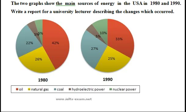
The pie charts compare the amount of energy taken from five different sources in the US between 1980 and 1990.

Overall, varied fluctuations were occurring in the proportion of these fuel sources over the given time. However, oil remained as the biggest energy provider, while power from the water was little exploited over the course of 10 years.

In 1980, oil accounted for nearly half of the national energy prior to suddenly dropping by 8%, at 33%, in the next years, yet played as the preferred power of all. Sharing the same pattern, the proportion of energy coming from natural gas dropped slightly, from 26% in 1980 to 25% in 1990. Meanwhile, hydroelectric power remained unchanged during the timescale, accounting for only one-twentieth of the total energy.

Conversely, a noticeable increase was recorded in both nuclear and coal power. Starting off at 22%, the percentage of energy generated from coal rose up to 27%, overtaking that of natural gas to be the second-highest in 1990. Remarkably, the amount of nuclear power grew twofold ten years later with the initial number being the same as hydroelectric power, at 5%.

p/s: I challenged myself with pie chart this time. Hope to hear from all of you.

  • Annotation2020072.png


jhhh11 14 / 30  
Jul 23, 2020   #2
Hi! Here are some suggestions for you:

- "varied fluctuations were occurring ..."
There are 2 mistakes in this sentence:
1/ "Fluctuation" is a wrong word choice. You should use this word in line graph essays where you can see how the data change over some points in time. In this case, you are comparing 2 points of time only.

2/ "were occurring" --> "occured" (simple past)

- "In 1980, oil accounted for nearly half ..."
--> Personally, I find this sentence difficult to follow, maybe there's a better way to write it?
OP banhbaooo03 2 / 4  
Jul 23, 2020   #3
@jhhh11
Thanks for your recommendation! I appreciate that!

And yes, I would love to hear your opinion on how to write this differently!
Holt  Educational Consultant - / 15344  
Jul 23, 2020   #4
You should be combining your trending statement with the rest of the summary overview for a far more effective 3 paragraph essay presentation. You should also include a listing of the energy sources in the summary overview to fully inform the reader about the general content and data basis for your information in the 2 reporting paragraphs. By the way, you should indicate the number of images you will be comparing in the summary overview.

There are only 2 years presented in the pie charts so I am wondering why you said "in the next years" when you should have been referring to the next decade, if that is what you were referring to in the sentence. The last paragraph does not indicate the year where the increase was recorded. This makes that sentence misleading and difficult to understand.


Home / Writing Feedback / The pie charts compare the amount of energy taken from five different sources in the US (1980-1990)
Do You Need
Academic Writing
or Editing Help?
Need professional help with your assignments? Fill out one of these forms:

Graduate Writing / Editing:
GraduateWriter form ◳

Best Essay Service:
CustomPapers form ◳

Excellence in Editing:
Rose Editing ◳

AI-Paper Rewriting:
Robot Rewrite ◳