Analysis of The bar chart
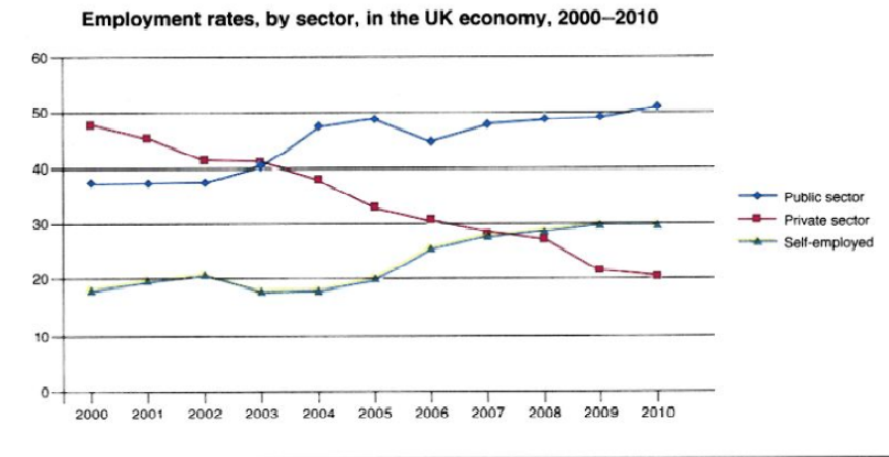
The bar chart illustrates the number of people who were employed in three different sectors of the economy in the UK. The graph is calibrated in the percentage of 11- year period.
Overall, what stands out from the graph is that both public and self-employed sectors had upward trends over time whereas significant downward trends can be seen in the private sector.
Regarding the employment rate of the private sector, nearly 50% of the population was working in private sectors in 2000 but then gradually declined to just under 30% in 2008. Then employment rate hit the trough in 2010 and became the least employed sector of the year compared to other fields.
As for the public section, the percentage of employment reached at 40 in the first three years and inclined to nearly 50% in 2003. Despite having slight fluctuation, the figure hit the peak at over 50 per cent. Similarly, if we look at the self-employed sector, under 20 per cent of people worked in this field in the first 2 years and it roughly fluctuated and stabled at estimately 30 percent in 2010.

tt.png
