Unanswered [6] | Urgent [0]
  

Home / Writing Feedback   % width   Posts: 5


The table gives information about the employment sectors in which people from 3 age groups worked


eyesliu0715 1 / 1  
Jan 27, 2020   #1

the amount of varied workplace worked by people of different age


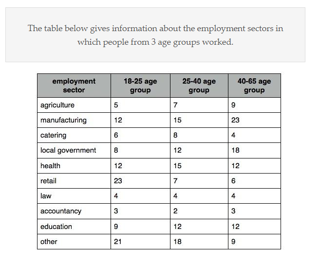
The table below gives information about the employment sectors in which people from 3 age groups worked.

The table illustrate the amount of varied workplace worked by different ages of people.

It can be clearly seen that both teenagers and middle-ages tend to work in other career, while for manufacturing is popular in middle-ages and seniors.

Now turning to the details, most of employment sectors are slightly rise in 25-40 age group which compare to 18-25 age group. However, citizens do not keen on 3 kind of careers in middle-ages when they grow up: retail, accountancy and other. One of them has a dramatic decrease, that is retail, from 23 to 7. Interestingly, law is the only one stable job among all workplace, it remains the same number (4).

In case of the manufacturing, it raise to 23 in retirement ages which is the highest number in all age group. Meanwhile, local government boost its figure 15 to 23 in 25-65 age. By contrast, catering, law and accountancy have insignificant figures in elderly residents: 4, 4 and 3 respectively.

  • .png


chiwchang 1 / 2  
Jan 28, 2020   #2
Sorry, but what exactly is your question?
Holt  Educational Consultant - / 15389  
Jan 28, 2020   #3
Your essay is highly confusing to read because you do not regularly and accurately use all of the information that is provided in the table chart. The summary paragraph is incomplete. It does not completely relate the topic, type of information presented, and classification groups listed. The trending sentence could have been better structured but is good enough since it clearly indicates the trend from the image. The last 2 paragraphs are the most confusing to understand. You need to learn to review your essay for clarity and complete information. If there are numbers in the image, it better be clearly in your summary report. It should also be properly structured in sentence form for easy understanding of the reader. Lack of proper information presentation will affect the overall score for this essay as the reader will find this difficult to understand, hence the lower scoring considerations overall.
OP eyesliu0715 1 / 1  
Jan 28, 2020   #4
@Holt
This table has too much information, I just tried to use 18-25 & 25-40 for b1, 25-40& 40-65 for b2.
How would you write it? I want to have a look your essay.

@chiwchang
The first sentence (bold one) is the topic.
Ulaai 3 / 42  
Jan 29, 2020   #5
Try to observe the data vertically (by age groups) first, then horizontally. You can start by creating general statements from each age group: young (not teenager), middle-age and older adults. You can express the number in percentages: provided you have enough time, you can find that the total adds up to 103, 100, 100 respectively. By doing this, you can notice things such as "manufacturing and health industry are equally popular for middle age workers."

After highlighting the preference from each age group, then you can view the data horizontally. You wrote "Interestingly, law ..., it remains the same number (4)." The data is not a statistic of career change, but rather how workers of different age are distributed in various sectors. So the correct way to see it is, "law is the sector in which the proportion for each age group is equal." Hope this helps you in forming ideas for your writing.


Home / Writing Feedback / The table gives information about the employment sectors in which people from 3 age groups worked
Need Writing or Editing Help?
Fill out one of these forms:

Graduate Writing / Editing:
GraduateWriter form ◳

Best Essay Service:
CustomPapers form ◳

Excellence in Editing:
Rose Editing ◳

AI-Paper Rewriting:
Robot Rewrite ◳

Academic AI Writer:
Custom AI Writer ◳