Unanswered [2] | Urgent [0]
  

Home / Writing Feedback   % width   Posts: 2


The table shows the obesity rate in one country over a period of time - TASK 1


trung3110 1 / -  
Sep 24, 2018   #1

obesity proportion in four age categories


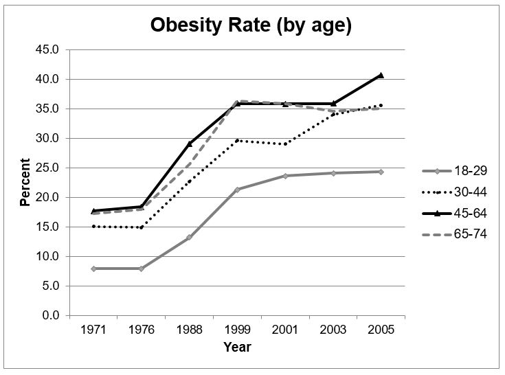
The line chart compares and contrasts data on the difference in obesity proportion of a country in four age categories from 1971 to 2005.
Looking at the graph, it is immediately obvious that obesity proportion underwent an upward trend over shown time. Generally speaking, the higher the age is, the easily people get obesity.

Initially, the obesity proportion in 18-29 age group stood steady then sharply increased from 1976 to 1999. Likewise, other groups of age doubled. In 1999, the 18-29 age group continuously increased and peaked at about 25% in 2005.

While the proportions of other groups experienced an increase in 1999-2005, the oldest group slightly declined to over one-third. The 30-44 age group fluctuated because of a decrease in 1999 and a rapid increase in 2001. The 45-64 age group reached a peak in 2005 by about 40% and seemingly had the highest proportion all time compared to other groups in the shown time.

  • The table shows the obesity rate in one country over a period of time. Summarise the information by


Holt  Educational Consultant - / 15386  
Sep 25, 2018   #2
Mai, while you wrote over the minimum required words, your essay shows a lack of analysis and proper summary overview because you do not present the required 4 paragraph format. The reason that you are lacking one paragraph is, aside from the improper summary overview, the presentation lacks the comparison points discussion as required by the prompt requirement.

You are being asked to make comparisons where relevant and, from the way I read your essay, you did not compare the overlapping points that are very obvious in the essay. The comparison points for discussion lie within the graph where the age ranges of 65-74 and 45-64 are just touching one another on the line and also intersecting at the 35 and 34 % markings within the chart. This lack of comparison discussion is going to cost you in terms of task analysis as your essay will be perceived to only be partially informative and missing important discussion points as indicated in the prompt requirement.

Your summary overview lacks a summary indication of the age ranges and the measurement type being used in the prompt. These are all important to present at the information helps the writer, that's you, to create a usable outline for the upcoming 3 paragraph discussion part. One positive point in your presentation though, your trending statement is well represented and considers the graph information accurately.

When you mention a rapid decrease and increase, don't forget to refer to the percentage measurement. Accuracy is the name of the Task 1 essay so, you have to explain what percentages these events happened at in order to clearly explain to the reader how and why it happened. When you say age groups doubled, mention the age ranges, again, the reader doesn't have access to this chart, so be as specific as you can in order to gain a higher TA scoring consideration.


Home / Writing Feedback / The table shows the obesity rate in one country over a period of time - TASK 1
Need Writing or Editing Help?
Fill out one of these forms:

Graduate Writing / Editing:
GraduateWriter form ◳

Best Essay Service:
CustomPapers form ◳

Excellence in Editing:
Rose Editing ◳

AI-Paper Rewriting:
Robot Rewrite ◳

Academic AI Writer:
Custom AI Writer ◳