the bart chart presentation
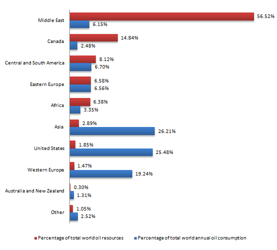
The chart below shows the proportions of the world's oil resources held in different areas, together with the proportions consumed annually in the same areas.
The bar chart compares different regions around the world in terms of oil resources and average consumption each year.
It is evident that oil resources and comsumption vary widely worldwide with Middle East possessing the majority of oil resource while most of oil consumed in US and Asia. By contrast, Australia and New Zealand hold the lowest percentage of oil resources and consumption
A striking 56% of world oil resources is made up by countries in Middle Easet, which is four times as large as that of Canada, the country having the second highest amount of global oil, at 14,81%. The percentage of Central South America, Eastern Eruope and Africa is only half that figure for each one. With regared to the remaining areas, the oil resources they have, in combination, account for well below 10% of world oil reservoir.
Turning to global annual oil consumption, the highest figures belong to Asia with 26.21% of the amount of oil consumed, followed closely behind by America, at 25,48%. Meanwhile, the proportions of oil used in other regions vary in the range of 1% to around 7%, except for Western Europe. These European countries utilized nearly a fifth of world annual oil consumption.
I am quite concerned about the number and quality of some comparisons.
I hope you guys can give me some advice on them
And if possible, can you tell me which band can I achieve with this essay?

IELTS_Writing_Task_1.png
