Unanswered [1] | Urgent [0]
  

Home / Writing Feedback   % width   Posts: 2


Writing task 1: The two pie charts below show the percentages of industry's sectors contribution


Vivian Gia Linh 1 / -  
Aug 4, 2023   #1

Industry and contribution for the turkish economy


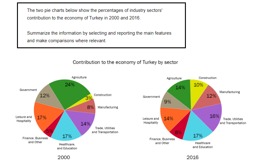
The given pie charts give information about the proportions of industry factors' economical contribution of Turkey between 2000 and 2016.
Overall, it is clear that agriculture made up the largest proportion in 2000, then, health protection and education took the place in 2016.
Looking at the chart in more detail, Turkey recorded that agriculture contributed the largest proportion of the Turkish economy, at 24%, which was 10% higher than the corresponding figure for 2016. Meanwhile, construction made up the smallest proportion, as it accounted for 3% of the economy, and then grew to 7% in 2016 . Beyond that, the figure for manufacturing stood at 8%, which was 4% lower, compared to the same category in 2016. As for trade, utilities, and transport, this factor accounted for 14%, which rose slightly by 2% in 2016.

With regard to the rest sectors, healthcare and education remained stable, which stood at 17% in both years, whereas leisure and hospitality constituted the same proportion in 2000, but the corresponding figure for 2016 decreased to 14%. What's more, there was an inconsiderable increase from 5% to 8% in finance, business and other. Regarding the last sector, the figure for the government initially stood at 12%, which was 3% lower afterwards.

  • 23.5.2020.png


Holt  Educational Consultant - / 15385  
Aug 9, 2023   #2
between 2000 and 2016.

You incorrectly interpreted the image. When you say between, that means there are years mentioned that connect the start year to the end year. Since there are no references to such, the indicator should be that you are only comparing 2 years in the presentation, based on the pie chart system. That error will cost you in the C+C and GRA preliminary scoring sections. You did a good job in the trending sections though. You were able to properly show a high and low trend based on the differing year values. The actual review could have been better defined, but is acceptable in this instance. Next time, try to use the 4 paragraph presentation. That format uses 3 comparison paragraphs for higher scoring considerations.


Home / Writing Feedback / Writing task 1: The two pie charts below show the percentages of industry's sectors contribution
Need Writing or Editing Help?
Fill out one of these forms:

Graduate Writing / Editing:
GraduateWriter form ◳

Best Essay Service:
CustomPapers form ◳

Excellence in Editing:
Rose Editing ◳

AI-Paper Rewriting:
Robot Rewrite ◳

Academic AI Writer:
Custom AI Writer ◳