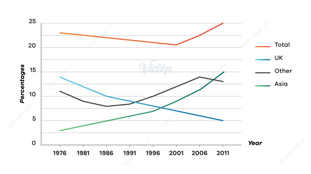
The chart below shows the percentage of Australian people who were born in different places of the world.
The line chart illustrates the percentage of Australian people born in different countries of the world from 1976 to 2011. The initial impression from the chart is that the figure for people born in Asia and Other enjoyed an upward trends, while that the opposite was true for the UK. Addition, The total population witnessed a slight decrease within first 25 years then increased 10 years later.
The proportion of Australian people who were born in UK, Other and Asia are approximately 14%,11% and 13% respectively. Over the next 25 years, Australian people born in UK witnessed a dramatic decrease of nearly 7% in 2001, in contrast to the figures for Other and Asia went up steadily to around 12% and 7% correspondingly. As can be seen from the total figure, Australians gradually decreased from around 22.5% in 1976 to nearly 20% in 2001.
In the following 10 years, the percentage of Australians born in UK dropped to 5%, while that there were a significant increase of 15% and above 12.5% in the number of population of Asia and Other sequentially. In addition, the total figure reached its highest peak at 25%.

The chart below shows the percentage of Australian people who were born in different places of the w
