Diazalichsan
Jan 4, 2017
Writing Feedback / Pie Chart: Comparison of Household in Japan and Malaysia in 2010 [4]
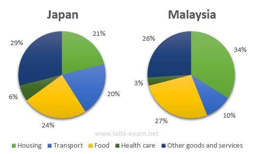
The pie chart illustrates the average domestic spending of Japan and Malaysia on five different categories in 2010. The most significant fact to emerge from the chart is both countries spent less in health care category.
Looking at the figures, the highest expenditure of Japan was in other good and service with over a quarter of all categories, while Malaysia spent more money in housing with 34%. Interestingly, Food sector became the second highest in both countries at 24% in Japan and more than a quarter of all proportion in Malaysia. Likewise, transportation also became the second least expense in both countries with a fifth of all categories in Japan and only one in ten of all categories in Malaysia.
Turning to another figures, housing sector became the third largest proportion in Japan with 21%. In contrast, Other goods and services occupied the third highest expense in Malaysia with 26%
Percentage of spendings in Malaysia and Japan
The pie chart illustrates the average domestic spending of Japan and Malaysia on five different categories in 2010. The most significant fact to emerge from the chart is both countries spent less in health care category.
Looking at the figures, the highest expenditure of Japan was in other good and service with over a quarter of all categories, while Malaysia spent more money in housing with 34%. Interestingly, Food sector became the second highest in both countries at 24% in Japan and more than a quarter of all proportion in Malaysia. Likewise, transportation also became the second least expense in both countries with a fifth of all categories in Japan and only one in ten of all categories in Malaysia.
Turning to another figures, housing sector became the third largest proportion in Japan with 21%. In contrast, Other goods and services occupied the third highest expense in Malaysia with 26%

15826394_13804818319.jpg


