Unanswered [5] | Urgent [0]
  

Posts by DanielDang [Suspended]
Name: Daniel Dang
Joined: Sep 11, 2022
Last Post: Nov 19, 2022
Threads: 5
Posts: 8  
From: Viet Nam
School: Cardiff Metropolitan University

Displayed posts: 13
sort: Oldest first   Latest first  | 
DanielDang   
Sep 11, 2022
Writing Feedback / Median hours spent on housework, childcare or gardening per week by married women and men [2]

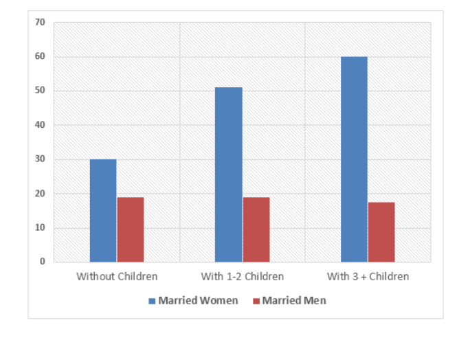
The average hours of unpaid work per week done by people in different categories


The bar graph compares married women and married men in terms of the median hours spent on housework, childcare or gardening per week in 3 sectors.

In general, the amount of time that women spend doing unpaid work is considerably more than men. It is noticeable that the wives need to do more work when they have more children, while there is a reverse trend in the husband's cases.

It can be seen from the graph that women without children spend 30 hours working on weekly housework or gardening. By contrast, families with 1-2 children consumed more wife's hours per week, at approximately 51 hours, 21 hours higher than who have no children. The figure for those who have three or more kids even higher, at 60 hours.

On the other hand, unpaid work doesn't cost much time of married men with nearly same amount of hours for categories of no children and 1-2 children, at around 19 hours. Furthermore, the amount of work done by husbands slightly fells by 2 hours when they have more than 3 kids.


  • Picture1.png
DanielDang   
Sep 20, 2022
Writing Feedback / Some individuals like to put more effort in their work [5]

I think the first paragraph is quite confusing and it doesn't help people understand your main purpose. The first sentence of the second paragraph is also confusing too and you have some issues with your grammar, e.g. more harder.
DanielDang   
Sep 20, 2022
Writing Feedback / The Graph Below Shows The Average Number Of Vietnamese Students Studying In France, America And RU [3]

I think your overview is quite confusing, instead you could just focus on 2 main features, the first one is the number of student compares to 3 countries, the second one is the trends of 3 figures, for example, the figure for USA and France increased while Russia decreased. For the line graph, it would be better to focus on the starting and the ending point of the line and compare it.
DanielDang   
Oct 6, 2022
Writing Feedback / The annual rice production of 4 countries [2]

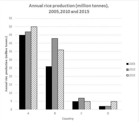
The annual rice production of 4 countries


The bar chart compares four different countries in terms of the amount of rice produced annually in 2005, 2010 and 2015. It is noticeable that the rice production of country A and B overtook that of country C and D by a wide margin. In general, while there was an increase trend in the output of rice in three out of four countries between 2005 and 2015, the figure for country C remained gradually the same.

In 2005, the productivity of rice of the country A was 45 million tonnes, compared to nearly 26 million tonnes of the country B. However, the total outputs of rice in B rose significantly to 43 million tonnes and closely caught up the productivity of A, at 47 million tonnes. The amount of rice per year produced by A kept the same trend and went up to 50 million tonnes in 2015. The figure for the country B bucked the trend with seven million tonnes decrease.

By contrast, the rice industry of the country C and D were considerably lower than other countries, with 5 million tonnes and 2 million tonnes respectively in 2005. By 2015, the amount of rice production of the country C and D shared comparable figures, with 5 million tonnes each.


  • Picture1.png
DanielDang   
Oct 16, 2022
Writing Feedback / [IELTS WRITING TASK 1] - NUMBER OF TOURISTS VISITING A CARIBBEAN ISLAND (2010 - 2017) [3]

I think you were misunderstanding the graph information so therefore your overview and comparison were wrong. The time in this essay is year, in a period of 8 years, not day as you wrote. The graph also gave you the data about what type of travel of the customers, not how much time they spent on the holiday. In writing task 1, the overview is really important so please make sure that you have a great overview for higher mark.
DanielDang   
Nov 12, 2022
Writing Feedback / Information about European people visited gym [2]

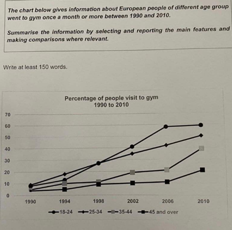
percentage of people visit to gym 1990 to 2010


The line chart shows the proportion of people going to gym in different groups of ages in Europe from 1990 to 2010.
Overall, the number of European people spending time on gym increased gradually over the period of 20 years. However, there was a much higher percentage of young people went to gym than ones in group of 45 and over.

In 1990, under 10% of adults in Europe took part in gym activities, with approximately 10% of people from 25 to 34, 9% of people from 18 to 24, 6% of 35-44 group and only 4% of people over 45. Over the next eight years, while the number of people visiting gym in the group of 35-44 and over 45 saw a slight rose, at 12% and 9% respectively, the figure for two younger ones increased sharply to 28% each.

By 2010, the figure for people aging from 18 to 24 had steadily gone up to nearly 60%, while proportion of adults in 25-34 group had risen to 50%. In contrast, the figure for those in 35-44 and above 45 experienced a significantly rise, at 30% and 20% respectively.


  • Picture1.png
DanielDang   
Nov 15, 2022
Writing Feedback / (Writing Task 1) The debris created by three companies [3]

I think the writer is lack of detailed number on the last paragraph, which could lead to a decrease in the overall score. You should add specific items, like percentage, to make your depiction clearer and more accurate.
DanielDang   
Nov 15, 2022
Writing Feedback / People living in cities and towns in some areas [3]

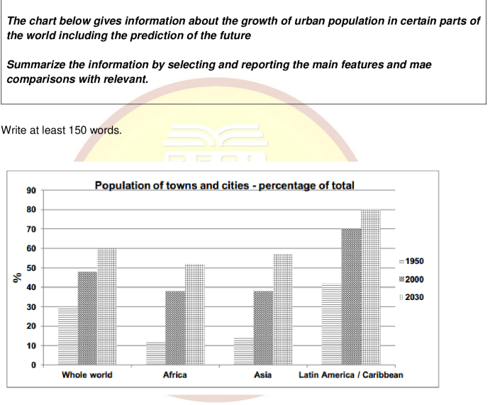
the growth of urban population


The given bar chart depicts the increase in proportion of people living in urban in Africa, Asia, Caribbean and the whole world in the year 1950, 2000 and gives prediction for the year 2030.

Overall, the growth of population in all given area rose dramatically from 1950 to 2000 and is expected to increase in 2030. In addition, the number of Caribbean's residents who stayed in the cities accounted for the highest percentage, while the figure for Africa was the lowest.

In 1950, there was more than 40% of population in Caribbean lived in metropolitan area, while the proportion of urban African and Asian was enormously low, at 11% and 14% respectively. By contrast, the figure for the whole world was 30%, slightly lower than Caribbean but far higher than other areas. After five decades, Caribbean experienced a significant increase in the number of urban citizens to 70% in 2000, compared to 48% of the whole world. It was also noticeable that the percentage of Africa and Asia inhabitants living in urban areas went up dramatically, at nearly 38% for each.

Over the next 30 years, four given areas are expected to continue the upward trend. Caribbean urban population is predicted to be the highest, with 80%, 20% higher than the figure for the whole world. Additionally, there are predictions of an increase in the number of Africa and Asia metropolitan residents, at 51% and 57% respectively.


  • Picture1.png
DanielDang   
Nov 19, 2022
Writing Feedback / The nitrogen oxide produced by 4 types of transports [2]

nitrogen oxide emission


The given line chart provided comparison of the amount of nitrogen oxide released by diesel car, petrol car, lorries and buses. From an overall perspective, it is evident that buses and lorries are more pollutant than two remained cars. While diesel car and petrol car dispose the same amount of emission as the speed increase, the figure for buses and lorries fluctuate mildly.

At the slowest level of pace, buses account for the highest amount of nitrogen oxide gas produced, at precisely 40 gam per kilometer. By contrast, lorries release nearly 33 gam per kilometer, which is slightly lower than buses but still much higher than other vehicles. The figure for diesel car and petrol car stands at approximately 7 g/k and 12g/k, respectively.

With the speed increases from 10 to 130 kph, the nitrogen oxide waste of buses experiences an oscillation, with the amount of emission decreases to 22 g/k at 60 kph before goes up to 45 g/k at the maximum speed. Similarly, lorries saw a steadily fall in the emission when the speed increase to 90 kph, but bucks the trend with 7 g/k rise at 130 kmh. While the amount of diesel car emission slightly fell by 2 g/k at the fastest pace, the figure for petrol car witnesses a small increase to 13 g/k


  • Picture1.png
Need Writing or Editing Help?
Fill out one of these forms:

Graduate Writing / Editing:
GraduateWriter form ◳

Best Essay Service:
CustomPapers form ◳

Excellence in Editing:
Rose Editing ◳

AI-Paper Rewriting:
Robot Rewrite ◳

Academic AI Writer:
Custom AI Writer ◳