Unanswered [13] | Urgent [0]
  

Posts by Kalyn17992
Joined: Jul 1, 2013
Last Post: Oct 7, 2014
Threads: 9
Posts: 19  
Likes: 1
From: Viet Nam

Displayed posts: 28
sort: Latest first   Oldest first  | 
Kalyn17992   
Oct 7, 2014
Writing Feedback / The increase in selecting to live individually helps people have a better life; some cons though [2]

In some countries, the number of people choosing to live by themselves is increasing rapidly in recent years. Why is this the case? Is this a positive and negative development for society?

It is true that in modern times, the number of citizens selecting to live individually is rising increasingly in many parts of the world. There are many reasons why this change has occurred, and in my opinion there are both positive and negative effects on individuals and society.

There are several reasons for this. One of the main reasons is freedom. Many people, particularly, young generations might do any tasks they want when living alone. In fact, some youngsters these days prefer to live far away from their parents so that they can cook for themselves the dishes they enjoy most and have meals with a good appetite without worrying about their weight or parents' reminders. Another cause is lifestyle. Some people are interested in discovering new parts of the life by themselves. For example, those might travel to any places they want without having their friends or family. By this way, they accumulate their useful experiences which are able to be essential to their work or life. Furthermore, some want to become maturer and more independent when they meet difficult circumstances or make decisions in the life.

One the one hand, these developments can be extremely positive. Living individually aids humans in relaxing and relieving stress or tension from their work. For example, after a busy week those can comfortably sleep without worrying about others' disturbance. On the other hand, living alone can also have the result of isolating people and suffering from mental and emotional diseases. In modern society, people are so busy with their work; therefore, if they choose to live by themselves, they in turn do not spend much time with their family or friends and then the relationship between family members is not close anymore.

In conclusion, the increase in selecting to live individually helps people have a better life but not all of the outcomes of this change have been positive.

(317 words)
Please help me check my essay if it supports and links to the ideas in each paragraph. Thanks in advance.
Kalyn17992   
Oct 11, 2013
Writing Feedback / IELTS WRITING TASK 1: THE TABLE/ Actual Vs Estimated house construction [5]

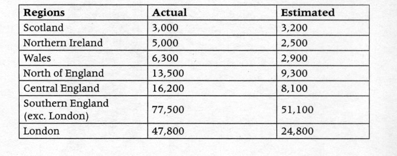
The table describes in thousands the estimated and actual numbers of houses built in the UK by region in 2002.
The table illustrates the figures for the estimated and actual numbers of houses built in the UK by region in 2002. Overall, the actual numbers of houses built in Britain were higher than the estimated ones.

In the Northern Ireland, there was a twofold rise in the actual number to stand at 5,000 compared to the estimated, the lowest figure of houses in 7 regions in the UK. Like wise, the figure for the estimated number of houses built in the Central English at 8,100, doubled to 16,200 in the actual number. In the southern England constituted the highest numbers of houses built in the UK both the actual and estimated. However, the figure for the actual number is higher than the estimated : 77,500 and 51,100 respectively.

By contrast, London was much lower and the second highest number of houses constructed at 47,800 in the actual figure and 24,800 in the estimated. It was estimated that in Scotland, the figure of houses set up was at 3,200; however, it only had 3000 houses actually erected.

(173 words)


Kalyn17992   
Sep 23, 2013
Writing Feedback / IELTS WRITING TASK 1: THE MAPS / coastal resort of Templeton [2]

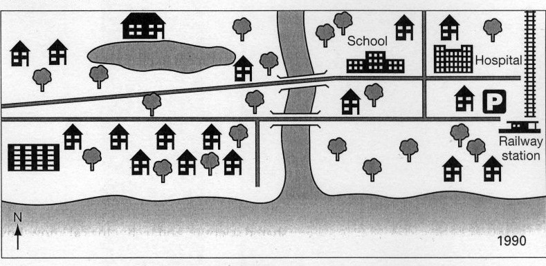
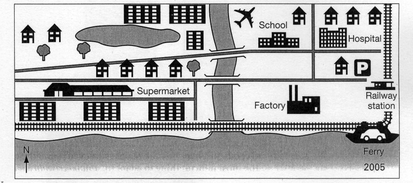
The maps illustrate marked changes which have taken place at the coastal resort of Templeton from 1990 to 2005.
In 1990, the settlement was a much greener residential area with a large number of trees and individual houses, but during the next 15-year period the area witnessed a number of rapid changes. The most noticeable is that all of the trees south-west of the river were cut down, with all the houses being knocked down and replaced by supermarkets and a new stretch of railway from the river running directly west. Moreover, a new ferry was also constructed next to the railway line.

In the south of the river, all of the trees were chopped down to build the factory. Further developments were the construction of an airport near the north-east corner of the river. Only a few trees north of the river were remained and made way for the houses and apartments. Besides, new houses in the center of the town were built near the streets.

Overall, a comparison of the two maps reveals a change from a largely rural to a mainly urban landscapes.


Kalyn17992   
Sep 20, 2013
Writing Feedback / Writing Task 1: The pie charts- Age groups in Oman and Spain [4]

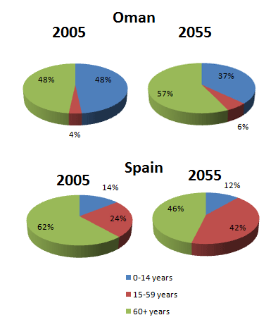
The pie charts illustrate the proportion of age groups in Oman and Spain between 2005 and 2055. Overall, people at the age of over 60 account for the highest percentage in both nations from 2005 to 2055.

In particular, in 2005, it is apparent from the charts the percentage of people under 14 made up in both countries: 48 percent and 14 percent respectively. However, it is anticipated that by 2055, the rate will fall slightly at 37 percent in Oman and 12 percent in Spain. Likewise, there was a higher proportion of over 60 year old Spain people compared to Oman ones at 62 percent in 2005. On the contrary, the prediction is that this age in Spain will dramatically decrease at 46 percent by 2055.

By contrast, the percentage of Oman population at the age of over 60 will considerably climb in 2055 at 57 percent in comparison with 48 percent by 2005. Similarly, in 2005, 4 percent and 24 percent of both nations were between 15 and 59. In contrast, by 2055, it is expected that the ages will rise approximately by half: 6 percent and 42 percent respectively.


Kalyn17992   
Sep 19, 2013
Writing Feedback / WRITING TASK 1: THE LINE GRAPH/ fast food consumed by teenagers [NEW]

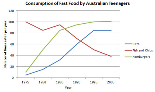
The line graph below shows changes in the amount and type of fast food consumed by Australian teenagers from 1975 to 2000.
Summarize the information by selecting and reporting the main features and make comparisons where relevant.
Write at least 150 words.

The line graph illustrates the number of fast food consumed by teenagers in Australia between 1975 and 2000. Overall, the consumption of fish and chips declined exponentially, whereas there was a rapid growth of hamburgers and pizza during the period.

In 1975, fish and chips are the most popular fast food with Australian teenagers, being eaten 100 times per year, while pizza and hamburgers were consumed fewer than approximately 5 times each year. However, from 1980 to 1985, after having a brief rise again, fish and chips plunged to a low of just under 40 times per year over the 25 years timescale.

By contrast, teenagers ate the other two fast food at much higher levels. The consumption of pizza climbed markedly until it overtook fish and chips consumption and it then levelled off between 1995 and 2000. The biggest growth among fast food was hamburgers, increasing considerably throughout 1980's and 1990's, exceeding fish and chips consumption in 1995. It finished at the same level that fish and chips began, with the consumption at 100 times a year.

(176 words)


Kalyn17992   
Sep 18, 2013
Writing Feedback / WRITING TASK 1: THE GRAPH; three different categories in the Britain economy [6]

There was a significant decrease in manufacturing from about 45 percent to 15 percent. This decline was particularly noticeable between 1975 and 2000, during which time the contribution of manufacturing just over doubled.

i mean between 1975 and 2000 the contributor of manufacturing had a double proportion.
maybe i did not show it correctly therefore you didn't understand
could you correct that sentence more perfectly?
thank you so much :))
Kalyn17992   
Sep 17, 2013
Writing Feedback / WRITING TASK 1: THE GRAPH; three different categories in the Britain economy [6]

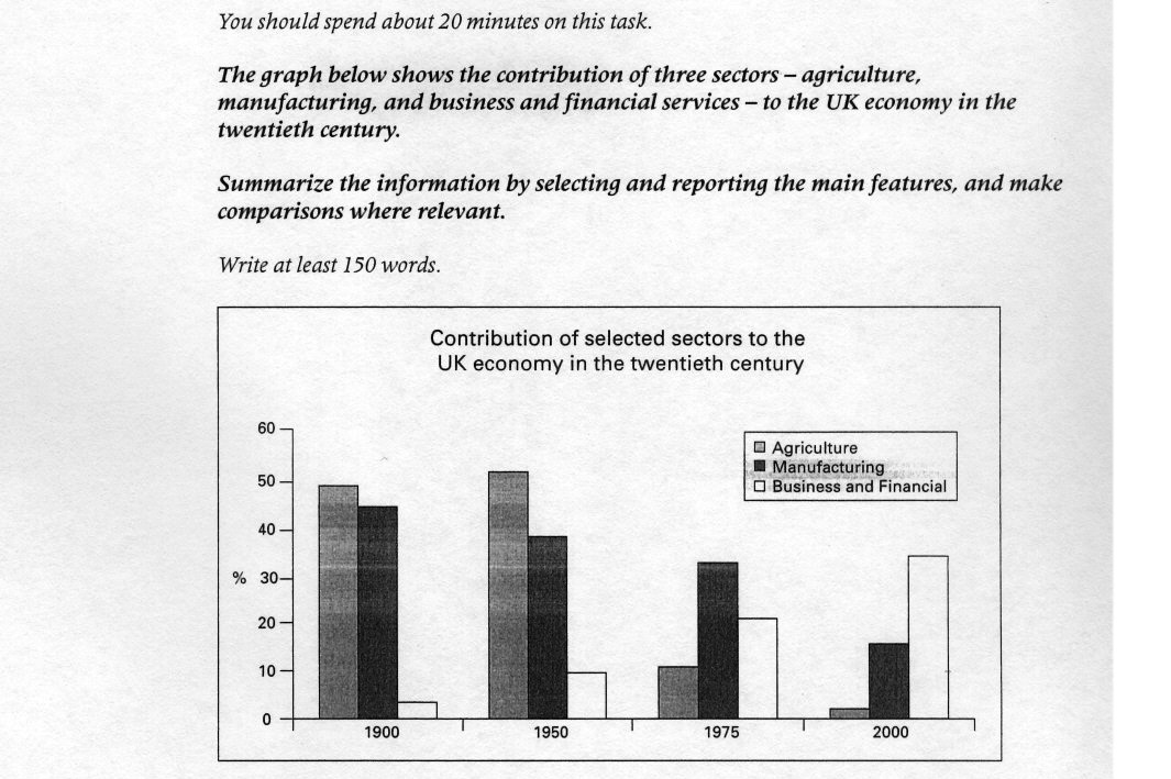
The chart describes the percentage of three different categories in the Britain economy during the hundred-year period from 1900 to 2000.
As can be seen clearly, the most striking feature of the chart is that there was a dramatic increase in business and financial through the period, rising from 4 percent in 1900 to just under 10 percent in 1950. However, in 2000, the figure for this sector was by far the highest at 35 percent.

The number of agriculture showed a considerable fluctuation. The percentage was just under 50% by 1900, but after reaching a peak of about 52%, the category suddenly fell to almost zero by 2000.

There was a significant decrease in manufacturing from about 45 percent to 15 percent. This decline was particularly noticeable between 1975 and 2000, during which time the contribution of manufacturing just over doubled.

To sum up, although business and financial was popular in 2000, the gap between the three types narrowed considerably over a 100-year period.


Kalyn17992   
Sep 17, 2013
Writing Feedback / Writing Task 1: The pie chart; People living in poverty in the UK [5]

The pie chart below shows the proportion of different categories of families living in poverty in the UK in 2002.
Summarise the information by selecting and reporting the main features, and make comparisons where relevant.
Write at least 150 words.
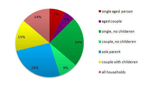
Proportion of people from each household type living in poverty

The pie chart illustrates the percentage of various types of families lived in poor conditions in Britain in 2002. In general, it is clearly seen that the most popular categories are single people.

It is apparent from the information supplied that sole parents was by far the highest proportion of 26 percent among all the given categories whereas couples with children accounted for a slightly lower 15 percent.

Single people with children made up a large percentage which is the second highest overall. In contrast, a mere 9 percent of the couples without any children suffered from poverty in 2002.

In terms of aged people, both singles and couples had roughly equal proportions in conditions of poverty: only 7 and 5 percent respectively.
Apart from couple and single people, there was 14 percent being lived in the entire households in the UK at that time.
Overall, sole parents constituted the highest percentage of families living in poverty in the UK in 2002.
(162 words)


Kalyn17992   
Sep 16, 2013
Undergraduate / LOCAL GOVERNANCE IN THE CITY OF SANTA ROSA - economic and social aspect of your city [3]

social development, moreover, is taken into high consideration through education and programs offered to attain a harmonious environment

social development, moreover, taken into high...
I think you should use relatives clause, there are two verbs in your sentence "taken" and "offered"
hope this helps
Kalyn17992   
Sep 16, 2013
Writing Feedback / Plato statement - There are many different types of music; Why we need it? [6]

As a children, thanks to lullaby of mother, we can sleep earier

children are plural noun therefore you should use "as a child" or "as a kid".

By dint of music, we finds friends that have something in common such as music styles, favorite singers

...., we find friends that....
Kalyn17992   
Sep 16, 2013
Writing Feedback / IELTS WRITING TASK 1: various nutrition of two different dinners [7]

there are some sentences i imitated how they wrote in the book "WRITE RIGHT". The ways can help us obtain high score in the IELTS exam about 7+

For example :

A glance at the two pie charts provided reveals

In stark contrast, however,

which is the most second widely enjoyed

and more
these phrases above are very exact
you can use that book and review it
Kalyn17992   
Sep 15, 2013
Writing Feedback / IELTS WRITING TASK 1: various nutrition of two different dinners [7]

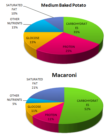
The pie graphs show the nutritional consistency of two dinners.
Write a report to a university lecturer describing the data.
Write at least 150 words

A glance at the two pie charts provided reveals the various nutrition of two different dinners.
In general, there is a dramatic rise of carbohydrates and saturated fat in macaroni than medium baked potato. On the contrary, medium baked potato has a much higher percentage of protein and other nutrients.

In particular, carbohydrates are the most widely enjoyed in both dinners, at 35 percent in medium baked potato and a exponentially higher 52 percent in macaroni. Likewise, a negligible 10 percent in medium baked potato, saturated fat is over double in macaroni.

In stark contrast, however, all other nutrition decrease in macaroni. Protein - which is the most second widely enjoyed nourishment in medium baked potato, accounting for 25 percent - is different from macaroni, a mere 11 percent. Similarly, there are also marked declines in nutritional consistency of glucose and other nutrients.

Overall, carbohydrates are the highest percentage of the five various nutrition in both dinners.


Kalyn17992   
Sep 15, 2013
Writing Feedback / Changing trends of local access to the advanced technology in the UK from 1996 to 2003. [4]

The graph below shows in percentage terms the changing patterns of domestic access to modern technology in homes in the UK.
Summarize the information by selecting and reporting the main features, and make comparisons where relevant.

The graph shows the percentage of changing trends of domestic access to modern technology in the UK from 1996 to 2003.
As can be seen clearly, the most striking feature of the graph is that the using of CD player, home computer and Internet access increased steadily over during this period. By contrast, there was a gradual fluctuation applying home computer.

CD player rose significantly from 60% in 1996 to just over 80% which accounted for the highest percentage between 2002 and 2003. Whereas, Internet access just only appearing by 1998/1999 occupied from nearly 10% to just above 40% in 2002/2003.

Between 1998/1999 and 2000/2001, the rating of mobile phone fluctuated wildly, but after 2000/2001, it increasing considerably to 70% compared to home computer only with 58% by 2002/2003.
It is clear that CD player and mobile phone made up the highest number of access to modern technology in Britain.
Writing
Editing Help?
Fill in one of the forms below to get professional help with your assignments:

Graduate Writing / Editing:
GraduateWriter form ◳

Best Essay Service:
CustomPapers form ◳

Excellence in Editing:
Rose Editing ◳

AI-Paper Rewriting:
Robot Rewrite ◳