Unanswered [6] | Urgent [0]
  

Posts by tiaDS
Name: Mba Tia
Joined: Jan 15, 2014
Last Post: Sep 30, 2016
Threads: 73
Posts: 222  
From: Indonesia

Displayed posts: 295 / page 1 of 8
sort: Oldest first   Latest first  | 
tiaDS   
Jan 15, 2014
Writing Feedback / IELTS task 1:the fishers in different regions and the world's top ten exporter of fish [2]

The chart and table show the number of fishers in millions for different regions between 1970, 1980 and 2000, and the world's top ten exporters of fish in 2000.

The bar chart and table indicate statistics about fishing over three decades ago for several countries.

Overall, Asia achieved the largest number of fishers than other countries in the world, and the top one exporter in the world come from Asia region.

The chart depicts the data of fishers in 1970, 1980 and 2000. Asia achieved the largest number of fishers at 9, 13 and 24 million respectively. Africa's fisher had 1.3 million in 1970 and dramatically increase 2 million in 1980 onwards. South America had constant numbers of fishers, 1.2 million throughout the period. In North America numbered 0.5 million in 1970 and sharply rose 1.2 in 1980, a number that kept unchanged in 2000. From 1970 to 2000, Europe had the fewest fishers who were under 0.6 million.

A more detailed look at the chart indicates that in 2000 listed five of the ten countries were from the Asian region and Thailand was the world's top one exporter of fish, but European and North American countries also followed in the next ranks. Norway and Denmark had second and fifth place, while the USA was in the third large exporter and Canada ranks sixth. China and Taiwan occupy fourth and seventh place, while Russia, Indonesia and South Korea took eighth, ninth and tenth spots.

P.S. Please kindly check my writing. I'm welcoming for anyone wanting to share ideas and opinions.
tiaDS   
Jan 15, 2014
Writing Feedback / IELTS Task 1: Summarize a map of the city of Brandfield [4]

So, can we conclude that the S1 has no bargains for a better spot?

I think this sentence should be the different paragraf, because it has coherence with the next paragraf (paragraf 3)
tiaDS   
Jan 15, 2014
Writing Feedback / IELTS Task 1 : Planning for the town [4]

The map below is of the town of Garlsdon. A new supermarket (S) is planned for the town. The map shows two possible sites for the supermarket. Summarize the information by selecting and reporting the main features and make comparisons where relevant.

The map depicts a town named Garlsdon in which has a population of 65,000. The local state has planning to establish a supermarket in the one part of two potential areas.

Overall, S1 is located between the main road and the railway to Hindon. What is more, S2 is situated in a traffic-free zone. However, running along S1 and S2 is the railway line.

A more detailed look at the map shows that the main difference between S1 and S2 is that S1 located in outside of the town, while S2 lies in the town centre. Road and rail can be compared as public transport facilities and their location have linked with three small towns. Standing in contrast, the main road is provided from three areas to visit in the Town centre. In the opposite, S1 only has main road from Hindon, so it would be more difficult to reach from Bransdon and Cransdon.

According to the map, S1 is situated in the northwest of Garlsdon, but it is close to the residential area of the town. S2 is near the housing area, which surrounds the town centre. Interestingly, Bransdon is linked to Garlsdon by the main road and does not have access to visit at S1. S2 is located in a traffic-free zone which is an area in a town where transport is not permitted to enter, but there is railway.
tiaDS   
Jan 15, 2014
Writing Feedback / music can nurse and improve feeling; The traditional vs international music [3]

There are many different types of music in the world today. Why do we need music? Is the traditional music of a country more important than the International music that is heard everywhere nowadays?

The earth has wonderful rhythms and sounds which cannot be imitated with anything in this world even using sophisticated an instrument. The sound of recurring waves of the sea, the flow of the river all have been a great influence on mankind. Music was born, following the day the world was created. Music has appeared into human beings over years, shaped by various improvements, used to reflect the feel of a person who plays it.

According to research that music can improve feeling and cure diseases. In fact, for woman who has pregnant, it is recommended to hear classis music, because the classic music can influence brain improvement from embryo. Having said this, different people have different a sense of taste for music. Some people hear music as media relaxation and keep rejuvenated throughout their life.

Moreover, for composers music is part of their blood. They have a sense how to make a song with great melody which is collaborated with fabulous lyric. When people get heartache, they hear pop music as a reflection their mood. Nowadays, many people are in hurry which have busy schedule for reducing problem most of people listen to music. Take one example in the office when employers face a terrible situation, music will create good soul and sensation in their mind. This research has shown why people are keen on music

Earlier in the decade ago, international music has grown a massive hold on which has influenced of the great globalization, communication, the way of life and shrinking of the world. Take one example, hip hop is a new genre which has been influenced in lifestyle, and it is quite popular. Standing in contrast, there has been changed in traditional music which is more affected by culture and traditional country. Collaboration between traditional music and international music has created to pour creativity by musician, nowadays.

On the other hand, each country has unique traditional music and it has correlation with culture and art of this country. In my country, Indonesia, there are many kinds of traditional music, and the most popular is 'Keroncong' which has unique melody which is produced by traditional instrument: Gamelan, for instance. Not to deny the fact that the traditional music has increasingly developed too. There have been adaptations made from the international music. The use of instruments has been very different and more advanced keeping in pace with technological advancements. Although they have been changed, the basic structure of the traditional music remains unique and unchanged.

In a nutshell, I deliberate that there is difference between traditional and International music. It is very important to preserve them. Hence, I believe that traditional music is more important than international music, which gives the sense of the tradition and culture; and is more than that of art.
tiaDS   
Jan 16, 2014
Writing Feedback / IELTS Task 1 : customer satisfaction lever with airlines and aspects of air travel [2]

The chart and table below show customer satisfaction level in the US with airlines and aspects of air travel in 1999, 2000 and 2007.

First of all, there are providing the data which consist of the bar chart of the job nation's major airlines and the table of specific aspects of the flying experience over the duration of several years period. A more detailed look at the chart indicates that from 1999-to-2007 the percentage of satisfied had increased onwards (65%, 69%, 72%), while dissatisfaction levels decreased, in 1999 was 32 percent, in 2000 was 29 percent and in 2007 was 24 percent.

Moving onto the data in the table of specific aspects of the flying experience, the satisfaction of courtesy of flight attendants grown in 1999 onwards and sat a peak at 92%. From 1999 to 2000, the numbers of satisfaction was a notable rise by up about 87-to-89 percent, while in 2007 percentage of courtesy of check-in/gate agents fell by 88%. What is more, Schedules occurred in the third place with 75% in the 1999 and stayed in the same percentage in the 2000-to-2007 (79 percent). Standing in contrast, the price of tickets was the bigger increase in satisfaction, where the figures rose nearly 1999-to-2007 approximately 30%, while the seating was least satisfied.

If we analyze the data we can see several trends clearly emerging. Firstly, the numbers of satisfaction year-by-year was rising well, while dissatisfied could resolve over the eight years. Secondly, turning to the data of flying experience, costumers were most satisfied with the courtesy of flight attendants. Having said this, the biggest increase in satisfaction was in connection with ticket prices.

All in all, the levels of satisfaction were growing throughout the period, and excellent service from staff was getting better to obtain good feedback from customer.
tiaDS   
Jan 16, 2014
Writing Feedback / IELTS Task 2 :Children need to eat a healthy meal at school! [4]

To learn effectively, children need to eat a healthy meal at school. How true is this statement? Whose responsibility is it to provide food for school children?

Adopting the best quote "regardless logistic our logic does not work" which indicate our topic that healthy food are quite notable to maintain health. Not only do children have to consume healthy food, but all people also need healthy meal to give energy and more active in the daily activities. Standing in contrast, why should children consume a healthy meal? The answer is common, because their bodies are still growing.

Most people agree with this statement that children have to eat a healthy food. It will be a problem for children when they are not getting enough nutritious from healthy food. Moreover, when children are hungry in the school day, they cannot focus on the lesson. As a result, children cannot participate fully and accept all of materials which deliver by teacher. If we compare a kid who has breakfast at home than who does not have breakfast, they will show different performance when children learn at school, for instance. Standing in contrast, productivity in school depends on not only healthy meal, but also the teachers who are of role to encourage sense of competition.

Having said and done, nowadays many working parents prefer to give money than serve healthy food at home. Because of that, some children eat something at school's canteen which sells various meals. If children are given a choice between crisps (junk food) and salad (healthy food), what do they choose? The answer is ironically "Crisps". So, school should consider about meals which are sold in the food court in which healthy food is provided. Having said this, bringing meals from home which is made by mother will be better than buy some food in canteen. In my experience, when I was school my mother always catered a meals which was eaten in the break time. The merit of this was more economically and more hygienist.

In my eyes, presumably healthy food will give extra energy for children in the school and will help children's bodies which are still growing and establish brain's nerve. However, parents and school should provide healthy meal in school and home. I ponder that the average food which is not as well-being as food was the past.
tiaDS   
Jan 17, 2014
Graduate / "Never relent on your last accomplishment" ; MSc Computer Science-SOP [5]

On the other hand, my love for software engineering cannot be fettered, while I was in the university I was on cloud nine when I learnt in-depth about software management and engineering.

1. While, Subject + Verb, Subject + Verb
2. Subject + Verb, While Subject + Verb
tiaDS   
Jan 17, 2014
Writing Feedback / IELTS - wealth countries achieved over 4.0% in 60s and declined sharply under 3.0 percent in 1970 [5]

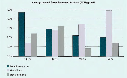
The graph below shows the average growth in domestic product in wealthy countries, countries that have adopted a global approach to business and countries that have not.

First in all, the chat depicts the average annual Gross Domestic Product (GDP) growth over ranging 1960-to-1990. There are mentioned three aspects; wealth countries, globalisers and non-globalisers.

A more detailed look at the bar chart informs that wealth countries achieved over 4.0% in 60s and declined sharply under 3.0 percent in 1970. Moreover, wealthy countries had dramatically decrease with 2.2% in 1980 and got the lowest percentage in 1990 (2.0%).

Moving onto globalisers countries, in 1960, the percentage of globalisers had 1.4%, while significant increased to over 2.5% in 1970 onwards. What is more, globalisers countries sat a peak in 4.9% in 1990.

Turning to the data non-globalisers countries had 2.3% in 1960 and increased gradually in 1970 (3.2%). Standing in contrast, in 1980, the percentage of non-globalisers feel significantly to 0.8%, while there was dramatically increase to 1.5$ in 1990.

If we analyze the data which informs that the globalisers countries was growing continuously and in the last period got a peak in over 4.5%. However, the wealthy countries year-by-year declines ironically from 1960 achieved 4.8% to 1990 reached 2 percent.

In my eyes, the countries which were adopting globalisers would get the highest percentage in the 1990, while the countries which were following non-globalisers had random percentage from 1960 to 1990. However, we have to consider with the wealthy countries which had dramatically decreased year-by-year.
tiaDS   
Jan 18, 2014
Writing Feedback / IELTS Task 1 : Harbour City Tourism [4]

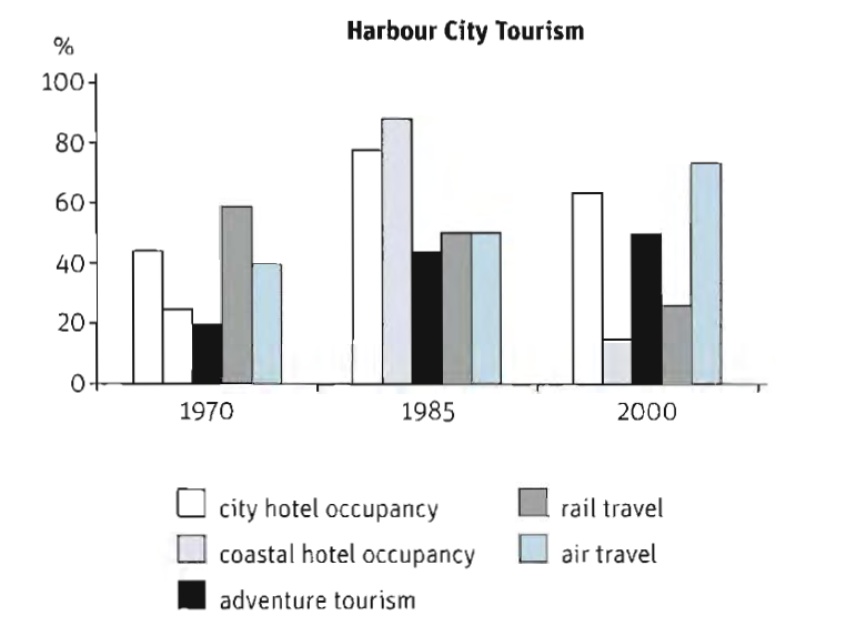
The graph below shows Harbour City Tourism

Turning to the bar chart depicts the percentage of trend in tourism in Harbour City Tourism over a 30-year period.

First of all, in the 1970, the percentage of accommodation had increased from 1970 to 1985. In the 1970 the city hotel sat in the 45% and coastal hotel only had 25%. Moreover, the percentage of accommodation had risen significantly which reached over 70 percent in 1985, there were 75%-and-90%. This figure of city hotel occupancy declined dramatically by under 70 percent, while coastal hotel occupancy had the lowest percentage (18%) in 2000.

A more detailed look at the chart shows adventure tourism rose from a low of 20 per cent in 1970 onwards to a peak at 50% in 2000.

Moving onto transportation, the number of passenger preferred to travel by train than by air in 1970. Interestingly, rail and air travel stayed in the same percentage (50%). While, the number of rail passenger fell to a trough of 25%, the percentage of air transportation grown significantly into 70%.

All in all, If we analyze the data we can conclude that there were fluctuation percentage of two kinds of accommodation, while the percentage of adventure tourism rose year-by-year. However, air travel more popular than rail travel which was used by traveler in the last 2000.


  • The_graph_below_show.png
tiaDS   
Jan 19, 2014
Writing Feedback / (IELTS TASK 2) closing offices to save energy [7]

As a result, this will affects to the employers

it should be : As a result, this will affect to the employers
(modal + verb infinitive)

My suggestion, rise your case to depict the advantage
tiaDS   
Jan 19, 2014
Writing Feedback / The given chart compares the amount of sales taking different products: games software, DVD and CDs [6]

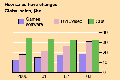
The chart below gives information about global sales of games software, CDs and DVD or video. Write a report for a university lecturer describing the information.

The given chart compares the amount of sales taking different products: games software, DVD/Video and CDs sold during a particular period of time over ranging 2000 to 2003.

Overall, looking backward 2003-2000, the amount of sold games software was a steady rise during the three years. Meanwhile, DVD/Video had more double amount of sales than in the 2000. However, the amount of sold CDs was a significant decrease from 2000 to 2003.

Turning to the chart, the sales of games software had a slight increase from 2000 to 2001 with 13-to-15 billion dollars, continued to 18 billion dollars in the 2002. Moreover, it was a peak in the 2003 with nearly 20 billion dollars.

More detailed look at the data indicates that between 2000 and 2001, the sales of DVD/video increased dramatically better the following years, with approximately 18-and-22 billion dollars. From 2002 onwards, the amount of sales suddenly began to grow sharply to 27 billion dollars, next continued to nearly 31 billion dollars in the 2003.

Moreover, the global products of CD achieved the highest amount in the 2000, while had a steady decline over 34 billion dollars in the 2001. Standing in contrast, this figure fell to a low of only 32 billion dollar in 2002, not leveling off until the end of year.


  • global_sales.png
tiaDS   
Jan 20, 2014
Essays / EE application - supplementary questions, additional information to share with the school. [4]

Do you think it is better to write something down.

Do you think that it is better to write something down?

I mean, in fact, I cannot predict what the professor is thinking and indeed, my idea cannot
be precise about the research of the professor.

my suggestion : if fact, i deliberate that i cannot give a prediction what the professor thinks, while my idea cannot be precise about the research.

please, you should pay attention with your grammar.

Intorduction : you should explain the general idea
Body : you should write more clearly what do you want to deliver the specific idea.
conclusion : here you have to make a summary from the content.
tiaDS   
Jan 20, 2014
Graduate / Male in the Speech Pathology field (SOP: Graduate School Essay/Letter) [4]

It was not until the professor wrote on the board "Intro to Communicative Disorders" that I sighed in relief and knew I was in the right place.

It was not until the professor who wrote on the board "Intro to Communicative Disorders" that I sighed in relief and knew I was in the right place.

Introduction : you should mention clearly the thesis statements
Body : Explain the thesis statements more detailed.
Conclusion : Summary of your essay.

i like your essay, but i have little confuse because your coherence is not really good.
tiaDS   
Jan 20, 2014
Writing Feedback / IELTS Task 1 : The percentage of international student in different Canadian provinces [3]

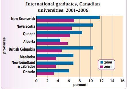
The graph below shows the percentage change in the number of international students graduating from universities in different Canadian provinces between 2001 and 2006

The chart indicates the percentage of oversea graduate students from universities based on several regions in Canada from 2001 to 2006.

According to the chart, in 2001, the percentage of overseas graduate students per each region in Canada had only about 3-to-7 percent. Meanwhile, in 2006, this figure had increased by nearly 4.5 percent to 12 percent higher than those in 2001.

A more detailed look at the graph presents that New Brunswick had the highest percentage as a province in Canada where the percentage of international students achieved nearly 7-to-12 percent, followed by Nova Scotia and Quebec where came second and third in the all provinces both in 2001 and 2006. Interestingly, the percentage of universities in British Columbia had more doubled than that of 2001, from over 4% to nearly 10.5 %. This figure was the highest increase of the other areas in Canada.

Turning to the data presents that Manitoba, Newfoundland & Labrador and Ontario had a sharp increase percentage from 2001 to 2006. However, Alberta had the lowest percentage provinces in Canada with 5.9 and 4.2 percent in the same period.

To conclude then, there had an overall increase in the number of pupils who studied in the universities in Canada over the 5 years period, while the proportion of international students in Alberta depicted the reverse.


  • canadian.JPG
tiaDS   
Jan 20, 2014
Undergraduate / HSF Academic Challenge- Science Fair Journey [3]

Last year, my AP Biology teacher Dr. Leo introduced me and my classmates to Science Fair.

Last year, my AP Biology's teacher, Dr. Leo, introduced me and my classmates to Science Fair

I didn't wanted

wanted(adjective)
form ( subject + did + not + verb1)

So, it should be : i did find

In my view your essay is good but in the last paragraph is jumping idea. You should make it more coherence.
tiaDS   
Jan 20, 2014
Writing Feedback / IELTS Task 1 : Global population figures and figures for urban populations [5]

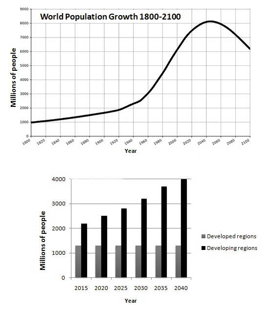
The graphs below provide information on global population figures and figures for urban populations in different world regions. Summarise the information by selecting and reporting the main features, and make comparisons where relevant.

The first graph illustrates the trend of wold society growth from 1800 to 2100, while the second chart depicts a prediction in the future over a 25-year period.

In general, it can be seen from the graph that the number of global population decreased in the last period (2100), while base on a forcast the majority of population will occur in the non-globalise countries from 2015 to 2040.

A more detailed look at the graph indicates that the number of population started from 1 billion of inhabitants in the 1800 and countinued a slow increase from under 1-to-2.5 billion of population between 1800 and 1950. Moreover, the growth rate rose shaply from the end of 1950 to early 2400 and achieved a peak at 8.2 billion by 2050. The global population suddenly began to decline a slightly from 2050 to 2100 and sat at 6.2 by 2100.

Turning to the chat presents the expectation that almost all populations growth from 2015 to 2040 will occur in cities of non-globalise countries and the number of citizen was a dramatic increase from 2015 onwards. In the globalise regions, however, over 1 billion populations over the next 20-year had not levelling off until the end of the 2040.

Overall, the graphs show that the majority of global population increase will not live in the particular world, but will be greater in some areas than others.


  • IELTS_tia.png
tiaDS   
Jan 20, 2014
Writing Feedback / GMAT - ANALYTICAL WRITING ASSIGNMENT - AVIA AIRLINES [3]

In my view, your essay is good but you have to know that there are 5 types of paragraph :
1. squence,
2. problem and solution,
3. cause and effect,
4. listing,
5. comparison and contrast,

and your essay is kind of listing, perhaps you can combine the each paragraph more complicated which adopt the different type or paragraph. As far as i know that you should make your reader more coriously, because your essay is predictable content. As a result i'm not really keen on to read it more.
tiaDS   
Jan 20, 2014
Writing Feedback / IELTS Task 1 : Population figures in Japan [5]

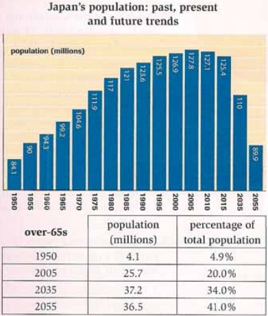
The chart and table below give information about population figures in Japan.
Summarise the information by selecting and reporting the main features and make comparisond where relevant


The graph and table illustrate information regarding population growth and the proportion of the society over 65s over a 100-year period in Land of Rising Sun.

In general, it can be seen from the graph that the number of Japan's population have fluctuated from 1955 to 2055, while based on the prediction the percentage of older people will widen substantially in the end of 2055.

Turning to the graph presents Japan's general population figures in 1950 started on nearly 85 million and countinued a sharp increase in 1955 onwards, but the number of population had begun a sharply decrease from 2005 to 2055. Standing in contrast, only 4.9% (41 million) of these people were well over the age of 65. Over a 55-year period the percentage of ageing had risen dramatically to 20 percent, while in the same time the number of population had depicted a parallel rise to by 128 million.

A more detailed look at the chart reveals the number of population sat a peak in 2005. However, the number of older people living in Japan will grow ironically to 37.2 million (34%) in 2035. Moreover, this figure will continue at a faster rate so that by 2055, 41 percent (36.5 million) of Japan people will be over 65s.

Clearly, by comparison give information two contrasting trends in Land of Rising Sun between the number of population and the greater number of elderly people.


  • japan_population.jpg
tiaDS   
Jan 21, 2014
Writing Feedback / IELTS Task 1 : Population figures in Japan [5]

Turning to the graph presents Japan's general population figures in 1950 started on nearly 85 million and countinued a sharp increase in 1955 onwards, but the number of population had begun a sharply decrease from 2005 to 2055

Well i have a grammatical errors : Turning to the graph presents that Japan's general population figures in 1950 started on nearly 85 million and countinued a sharp increase in 1955 onwards, but the number of population had begun a sharply decrease from 2005 to 2055.

Thanks for your correction, but i'm trying to improve my grammar skill, so i decided to use complex grammar in each sentence.
tiaDS   
Jan 22, 2014
Essays / I don't understand my essay prompt and need help starting out. [4]

honestly, i do not understand what you want to deliver for us.

Intoduction : this section consists of general information which mentions thesis statement
Body : thesis statement will be explained in this section
Conclusion : summary of your statement (you can creat paraphasing from introduction)
tiaDS   
Jan 22, 2014
Writing Feedback / IELTS Task 1 : The challenges people face when they go to live in other countries [5]

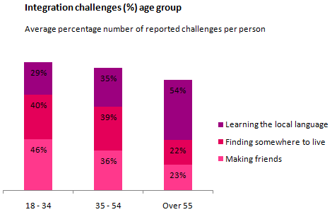
The chart below shows information about the challenges people face when they go to live in other countries.
Summarise the information by selecting and reporting the main features, and make comparisons where relevant.


The given chart reveals about the percentage integration challenges based on age group when they immigrate in. Generally, there are three age groups which are; 18-34, 35-54 and over 55, and three aspects which are being appraisal of reported challenges per person.

Turning to the data, for age group 18-34, the new place (40%) and friendship (46%) are the main challenge aspects when they move to a new country, while language-learning is the easy one for them to be learnt with 29 percent. Standing in contrast, older people, aged over 55, get an obstacle to learn the second language with 54% difficulties level. However, they are more easily for making friends and finding somewhere for living, over 20 percent.

A more detailed look at the chart depicts that balancing the percentage of problem aspects for people, who have aged 35 to 54, are stable in approximately above 35%. In contrast, adults have lowest percentage in local language, while language-learning is the main problem of elderly people. Moreover, the data shows more doubled percentage (23% to 54%) of reported challenges widely regarding to people's ages.

In conclusion, each age group has different problem when they adapt in the new environment. Perhaps, people have different understanding about problem-solving skill to reduce culture shock.


  • immigrate.png
tiaDS   
Jan 22, 2014
Writing Feedback / IELTS: Who should care for the elders? [7]

such as the U.K.

as long as i know, the name of country is not followed by article 'the', exception for The United States

Also, the government receives taxes and mustutilizes it for a better lifestyle for people of all ages, especially the old.

(i'm confuse with this sentence)
Also, government receives taxes and utilizes which is better influences for helping older people.

Having said that, family members of the aged individuals, who stay in homes, must ensure that they pay required money to the care centres as it is their primary duty to look after family elders .

please rewrite this sentence.

(pay attention with your grammar)

You should recognise about five types of paragraph:
1. Sequence
2. Problem and solution
3. Cause and effect
4. Listing
5. Comparation and contrast.

you have to make this essay consists of approximately 4-5 paragraph. I suggest you to make 5 paragraph:
1. Introduction : general ideas, you should mention thesis statements.
2. Body 1 : detail of thesis statement 1
3. Body 2 : detail of thesis statement 2
4. Additional statement
5. Conclusion

You have to make your reader more curiously, do not make predictable paragraph. Moreover, coherent and cohesion are essential thing when you make every single sentence.
tiaDS   
Jan 22, 2014
Writing Feedback / IELTS Task 1 : The challenges people face when they go to live in other countries [5]

Before this detailed paragraph, you need to come up with an overview of this graphical presentation which discuss the more significant observations very briefly without any support from data

Dear Pahan, i really appreciate with your suggestion.
It is my overview, because i only have 1 sentence in introduction, so i decided to join overview and introduction in one paragraph. Please give me your suggestion.

Generally, there are three age groups which are; 18-34, 35-54 and over 55, and three aspects which are being appraisal of reported challenges per person.

As it is an IELTS task1 essay, I suggest to add at least one sentence describing the data for age group 35 to 54 in the second paragraph.

It is because all aspects in age group 35-54 have percentage over 30 percent, so i mention

are stable in approximately above 35%.

tiaDS   
Jan 22, 2014
Essays / I don't understand my essay prompt and need help starting out. [4]

Question one sort of throws me off. Do you think I am supposed to justify data theft through ethics or the fact that stealing is right or wrong?

In my eyes, I cannot mention that it is a criminal or no. Some people argue that as long as the data is used to give contribution a journal, it is fair to use it. Standing in contrast, scientific journal is an authentic intellectual asset which is covered by law. As a result, I deliberate that we can adopt the main idea, so we can paraphrase base on own words and give additional information.
tiaDS   
Jan 22, 2014
Writing Feedback / IELTS Task 1 : Global population figures and figures for urban populations [5]

Well, i try to use 'society' to replace 'population'. thanks for your advice, i will more be carefully.
According to Oxford learner's thesaurus
society : people in general, living together in communities
population : all the people who live in a particular area, city or country.

You cannot use past tense because what you see from 2014 onward are their predictions on population growth.

Yes, i have a mistake in this statement. i should use simple future to depict condition in the next years. thanks pahan.
tiaDS   
Jan 22, 2014
Writing Feedback / The bar chart depicts the percentage how Britons spent the amount of money for buying fast foods [2]

The chart below shows the amount of money per week spent on fast foods in Britain. The graph shows the trends in consumption of fast foods. Write a report for a university lecturer describing the information shown below.

Given the bar chart depicts the percentage how Britons spent the amount of money for buying three types of fast food: Hamburgers, Fish & Chips and Pizza. Moreover, the line graph illustrates the fast-food consumption ranging from 1970 to 1990.

In general, the figures reveal that hamburger was the highest income in weekly which was the popular meal consumption, while fish and chips had a fluctuation percentage during a period of 20 years.

First of all, hamburger had the highest percentage more than 40% in high income category, while fish & chips and pizza came to second and third with nearly 20%. Meanwhile, in average income category hamburger still led as the highest percentage, but there were differences that the fish & chips achieved higher percentage (25%) than pizza (12%). Standing in contras, fish & chips got the highest percentage in nearly 20 pence, while the percentage of hamburger declined by 13% and pizza fell to 6%.

A more detailed look at the line graph shows that hamburger and pizza started from under 100 pieces, while fish & chips had over 300 grammes in 1970. The first ten-year period, between 1970 and 1980, hamburger and pizza increased steadily, but fish & chips decreased less than 250 grammes. In 1985 onward, hamburger and pizza still rose sharply and sat a peak at over 500 grammes for hamburger, nearly 300 grammes for pizza. However, in 1990, fish & chips had again reached the same figure as in the middle 1975s with 250 grammes.

If we analyze the date we can see several trends clearly. Firstly, the percentage of hamburger in high income category was tripled than that in low income category. While the percentage hamburger and pizza were a sharp fall, fish & chips had a fluctuation percentage in three income categories. Having said and done, from 1970 to 1985, the grammes of hamburger and pizza increased significantly as many as percentage in high income.

To conclude them, I deliberate that hamburger was the popular type of fast food which was consumed and held the highest income in weekly spending by Briton.


  • fast_food.jpg
tiaDS   
Jan 23, 2014
Essays / Need some input on what to write about for personal experience essay. [5]

you can make this essay consists of 4 paragraph:
1. Intoduction : this section consists of general information which mentions thesis statement
2. Body 1 : thesis 1 statement will be explained in this section
3. Body 2 : thesis 2 statement will be explained in this section
4. Conclusion : summary of your statement (you can creat paraphasing from introduction)

Need Writing or Editing Help?
Fill out one of these forms:

Graduate Writing / Editing:
GraduateWriter form ◳

Best Essay Service:
CustomPapers form ◳

Excellence in Editing:
Rose Editing ◳

AI-Paper Rewriting:
Robot Rewrite ◳

Academic AI Writer:
Custom AI Writer ◳