Unanswered [14] | Urgent [0]
  

Posts by joythblessy
Joined: Sep 24, 2012
Last Post: Nov 30, 2013
Threads: 86
Posts: 272  
Likes: 15
From: India

Displayed posts: 358 / page 1 of 9
sort: Latest first   Oldest first  | 
joythblessy   
Nov 30, 2013
Writing Feedback / IELTS academic - Rules on loan and credit card [6]

hai...

I too agree that your answer is out of topic.

As a result of using large sum of money through credit card, which is not paybacked, banks face shortage of money. This may affect the economy directly or indirectly.

As the banks were not able to give money to the business firms the growth of business will dininish, unemployment, low tax return and the government may suffer.

Unemployment limits the return of money dubt money, back to bank.

As banks became empty the individual, society and the society suffers.

Results in recession....).

Tessy.

This shortage affect directly or indirectly to the economy
joythblessy   
Aug 12, 2013
Writing Feedback / IELTS: CLIMATE CHANGE ISSUE - Not enough political action! [8]

Hai ...

You have good points..

I do agree with bibin's advice and Dumi's guidence.

I feel it is better to write the second body para as 1st body para, coz, it is bit stronger.

Try to connect the points to the question.
Everybody knows that corruption is running every where.... Connect it to the question...).

Politicians rise money for their personal needs by keeping a blind on the big factories which polute environment after receving a hunge amount of bribe.

All the best..
Tessy.
joythblessy   
Aug 12, 2013
Writing Feedback / IELTS writing task 2- Doing the same job for whole the life or changing it frequently [18]

Hai Ahmed...

I like your conclusion.

The question is to discuss both points and give your opinion...).

Take 1st part, cont.. Same job.
Write both positive and neg. With examples in the 1st body para.

In the second body para take the second part, do the same.

Which one you support give strong positive points, and weak negatives.

Additional points.
1st para
+tive..
Establish a solid position and promotion, long experience and loyalty, higher benefits, steady income, job and financial security, plan future and better savings for future.

-tives.
Monotonus job, de-motivated and reduced quality of work.

2nd para.
+tive.

Enrich the life experiences.
Explore new ideas and skills,
More versatile , confident and dinamic.
Better cope with difficulties of work plaCe. Job security in the time of economic cricis....

-tives,
Employers may not trust these people.
May distrub the life od dependents due to continous change of work places.
Problems and challenges in the new job maynot be always favorable.

All the best..
Tessy.
joythblessy   
Mar 3, 2013
Writing Feedback / IELTS: Germany and Italy spend between 150 to 158 thousand pound sterling in all categories [2]

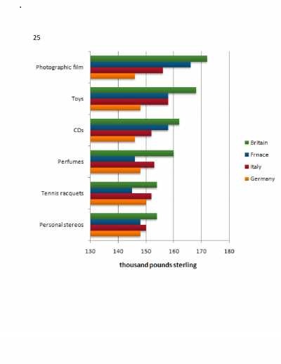
The chart below shows the amount spent on six consumer goods in four European countries.
Write a report for a university lecturer describing the information shown below.
- You should write at least 150 words.
- You should spend about 20 minutes on this task.

The chart illustrates about the amount of spending in thousand pound sterling on photogenic films, toys, CDs, perfume, tennis racquets and personal stereos by Britain, France, Italy and Germany.

Overall, Britain spends the highest amount in all six categories. France spends minimum in personal stereos, tennis racquets, and perfumes. Germany spent minimum in the remaining categories, CDs, toys and photographic films. The expense of Germany in all six items between 145 to 150 thousand pound sterling with minimal difference in all categories. In case of Italy, the spending is in between 145 to 158 thousand pound sterling. The highest 158,000 pounds sterling for toys and the lowest for personal stereos.

There is a considerable difference in the spending of France in all six items. It is between 145 to 148,000 pound sterling for perfumes, tennis racquets, and personal stereos. The remaining three items France spend between 158 to 165 thousand pound sterling, which are CDs, toys photographic film. In Britain expanse on six categories significant difference. It is equal for personal stereos and tennis racquets 153 thousand pound sterling. The four items expenditure is between 160 to 172 thousand sterling that include perfumes, CDs, toys and photogenic films.

In short, these four countries displayed a significant difference Germany and Italy spend between 150 to 158 thousand pound sterling in all categories. France also followed the same trend expect in photogenic film. The financial capacity of the Britain is high among the four countries.

The chart below shows the amount spent on six consumer goods in four European countries.
Write a report for a university lecturer describing the information shown below.
- You should write at least 150 words.
- You should spend about 20 minutes on this task.


joythblessy   
Mar 3, 2013
Writing Feedback / IELTS: The factors that contribute for happiness [4]

Hai Han..

Your essay is good. But the ideas in it is confusing. i personally believe that the dream and the straggling to achieve it is the main reason of unhappiness. The dream job in Australia and continuous failure in IELTS w,r,l,s any one is dropping each attempt. How he will be happy....?....).

According to me...happiness....

contentment and peace of mind is the basic thing. we should live within our means and know our strengths and weakness,
avoid unfair means to resort wealth,
make and maintain good friendships,
freedom of worries and anxieties,
Maintain good health, well balanced diet, regular proper exercise, adequate rest.
positive attitude., unselfishness
good hobbies to fill the leisure time.
good relationship with family and friends.
a clear conscience.
emotional intelligence

not every poor man is unhappy and not every rich man happy...

all the best..

Tessy

AVOID SHORT MESSAGE LIKE THANKS...THESE ARE THE SHORT CUTS TO SUSPENSION....(.
IF YOU LIKE SOME COMMENTS THEN GIVE LIKE BY PRESSING THE ICON.
joythblessy   
Mar 1, 2013
Writing Feedback / (IELTS essay) Decrease in future international travel is a positive development? [4]

Many people think that international travel will decrease in future. Do you think it is a positive development? Give examples from your experience.

Due to the advancements in technology, many people think that international travel will diminish in the future. If it happens like this, I feel it will be a positive development because of a couple of reasons.

To begin with, reduction in the international travel for tourism will be beneficial for reducing the impacts of global warming. The increased use of air travels, which undeniably leads to pollution in the highest level of our atmosphere, is one of the main reasons of depleting ozone layer that gives rise to global warming. The air and noise pollution by the airplanes also will reduce as the number of flights services may reflect due to the reduction in the number of tourists. Moreover, plastic wastes in the tourist spots became a headache for the local governments. Plastic and other waste materials destroy the natural flow of wastes. Furthermore, local tourism will boost up as people are interested to visit the tourist attractions of their own countries.

Apparently, the international tourists affect local culture and traditions and conflicts between tourists and tourists will be declined. The natural beauty and landscapes are destroyed for making facilities like hotels, roads, beaches, airports and so on for boosting tourism. The limited number of international tourists will save the natural beauty of these places to and extend. Besides, local art forms are used to re-tuned for the convenience of these foreigners and it lost its beauty ultimately. For instance, Kathakali of Kerala, is a traditional melodrama of three hours, which is re-tuned for the foreigners that finish within half an hour, ultimately, lost its real beauty.

Finally, the advanced medical treatment, latest educational facilities, high-tech transportation, and career options with high salary if available in the home country, it will dramatically improve the standard of livings of people and there by trim down the need of international travel. The out lets of Multi-national companies give us the international shopping experience too.

In conclusion, I believe that if international tourism may diminish in the future, it will bring a number of positive impacts for the individual, society and country. Therefore, I consider it will be a positive development.
joythblessy   
Mar 1, 2013
Writing Feedback / (IELTS graph)The difference in the percentage of expense for seven items:30yrs period [2]

Write a report for a university lecturer describing the information below.
- You should write at least 150 words.
- You should spend about 20 minutes on this task.

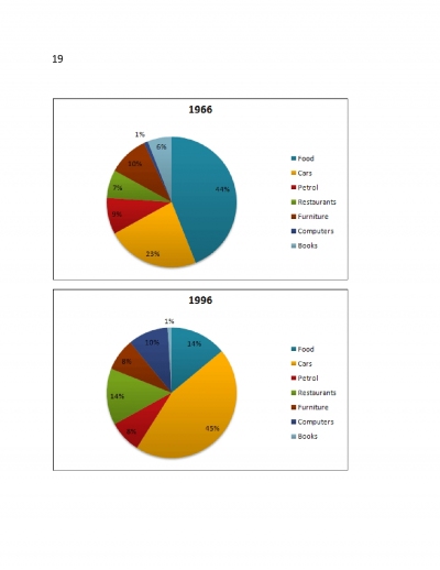
The given two pie charts compare the difference in the percentage of expense for seven items between the years 1966 and 1996. These items included food, cars, petrol, restaurants, furniture, computers and books.

At a glance, there were remarkable raise in the expense of three items in 1996, which are cars, restaurants and computers, whereas food and books expenditure reduced drastically. Petrol and furniture showed minimal changes. Turing to detail, in 1966, there were 44% of the total expense were spend for food which was reduced to one third percentage 14% in 1996. In case of cars and restaurant, spending shot up and reached double in 1996, which were 45% and 14% respectively.

The percentage of expenses for petrol and furniture displayed 1% of decrease and 2% decrease respectively that were minimal. The expense on books was declined to six times in 1996, 1% than in 1966, 6%. Computers showed a significant change. The demand of expense on computers shot up to ten folds in 1996 than in 1966 and stayed in 10%.

In short, there was notable increase in the expense of computers in the year 1996, which dropped the demand of expense on books to six folds in 1996. The total life style of the people was changed after 30yrs from 1966 that was demonstrated by the heaping in the percentage of expenses in cars and restaurants.

Write a report for a university lecturer describing the information below.
- You should write at least 150 words.
- You should spend about 20 minutes on this task.


joythblessy   
Feb 28, 2013
Writing Feedback / (ielts graph)The trends in consumption of fast foods in U.K [2]

The chart below shows the amount of money per week spent on fast foods in Britain. The graph shows the trends in consumption of fast foods.

Write a report for a university lecturer describing the information shown below.
- You should write at least 150 words.
- You should spend about 20 minutes on this task.

The given graph illustrate the changes in the popularity of the fast food conception in a period of twenty years from 1970 and the percentage of expenditure for fast food for three categories of people according to their income, high, average and low for pizza, hamburger, and fish and chips in UK, 1990.

Overall, the high and average income people spend their higher percentage of fast food expense for hamburger, whereas, the low income people prefer fish and chips. The popularity of hamburger and fish and chips are continuously increased, while demand of pizza reduced throughout the years of review.The first bar chart high income people spends 42% of their experience of fast food in hamburger which is more than double of the expense in pizza and nearly three times higher than fish and chips. The people with average income there is a difference of three times with pizza expenses and a marginal difference of 6% with fish and chips while comparing them with hamburger expense. On the contrary, low category people choose fish and chips as their favorable fast food 16%, which is closely followed by hamburger 18%. The pizza usage is half of the expense of hamburger.

In the second graph, there was a minimum difference between the use of hamburger and pizza in 1970, continued its increased use in the same level roughly until the mid 1980. There after both showed a considerable increasing trend. The fish and chips usage shot up from 150 to 500in the next two and half years while hamburger use climbed from 80 to 280. A negative trend is shown by pizza use. In 1970, it was 300 continuously dropped and reached to 200 in mid 1985 and thereafter shows a negligible rise in the end of 1990.

In short, the health concern of the people increased and the use of fish and chips raised high and average income people consider hamburger as their favorite, but poor people's favorite is fish and chips.

Hai dumi..
I don't know how to reduce the word strength...(.


joythblessy   
Feb 26, 2013
Writing Feedback / (IELTS graph)Average monthly temperatures and rainfall in the city of Kolkata [2]

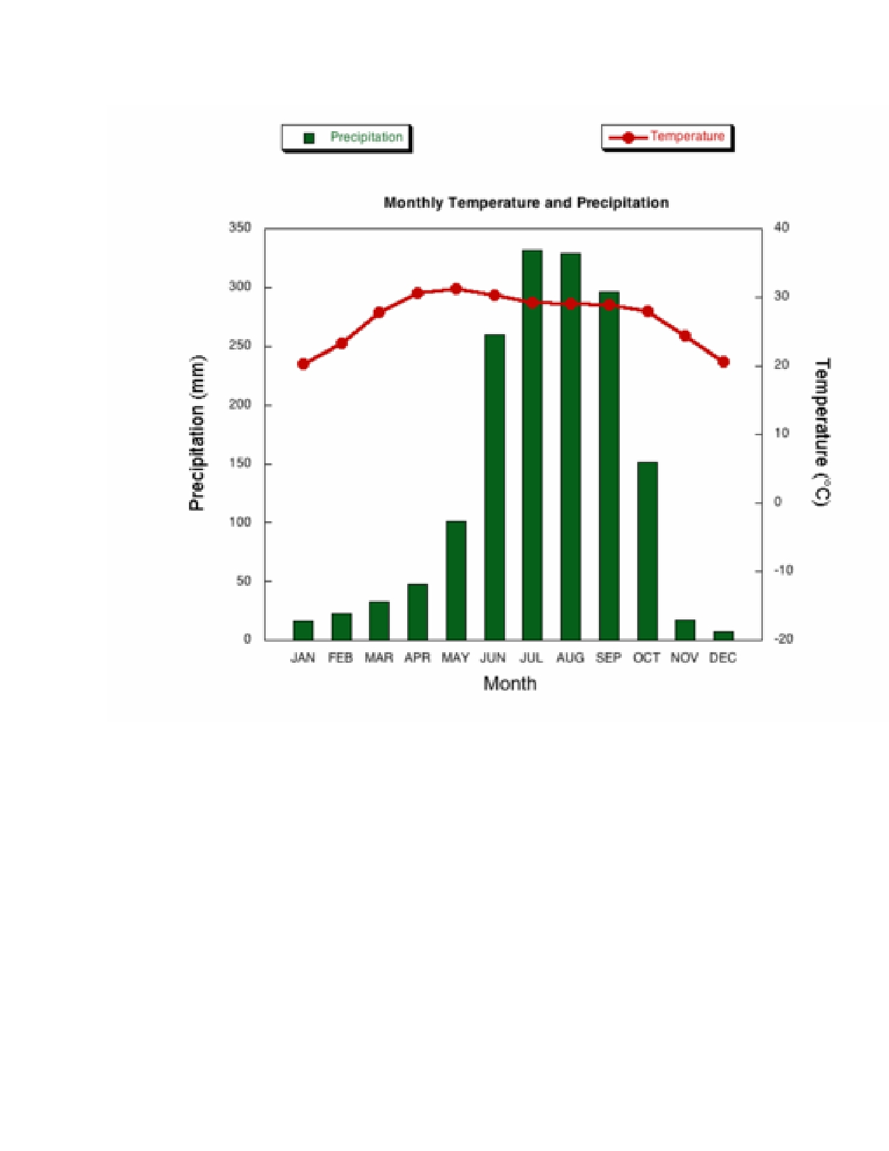
The climograph below shows average monthly temperatures and rainfall in the city of Kolkata (or Calcutta).

The given graph provides information regarding the average monthly temperature and rainfall of all months througout the year in the city of culcutta.

Turning to detail, the level of rainfall was slowly raised from 20mm in January to 50mm in April. It doubled in the following month. There was a significant increase of rainfall in the following two months, June and July. It shot up from 100mm to 250mm , a rise of 2.5 times in june and 330mm in july. It reached the peack and remained the same for the next month. Thereafter it showed a negative trend of decreaseing. In october in droppd to nearly half of the previous month's rain. In November and December it further declined and reached to 25mm and 20mm respectively.

In case of temperature also it showed an upward trend and it rose sigificantly from 20degree in January to 30degree in May, which was the peak. Then it slowly reduced slightly and remained the same for the next three months. The following three months it declined continously and reached the same maximum level as it was in January which was 20degree.

In short, in calcutta, the highest rainfall were experienced in the month of July and August lowest in december. The hottest month was May and the coldest were January and December.

The climograph below shows average monthly temperatures and rainfall in the city of Kolkata (or Calcutta).


joythblessy   
Feb 25, 2013
Writing Feedback / Influence of neighborhood on the growth of children [5]

hai Ibrahim...

You have some good points, as Dumi pointed out it didnt come out nicely..

Try to seperate the paragraphs wih double. Especially in the small screen of mobiles it seems to be conjusted.

Read more and more essays..

Tessy
joythblessy   
Feb 24, 2013
Writing Feedback / (IELTS graph)the hours of leisure time/yr spend by people in Someland. [3]

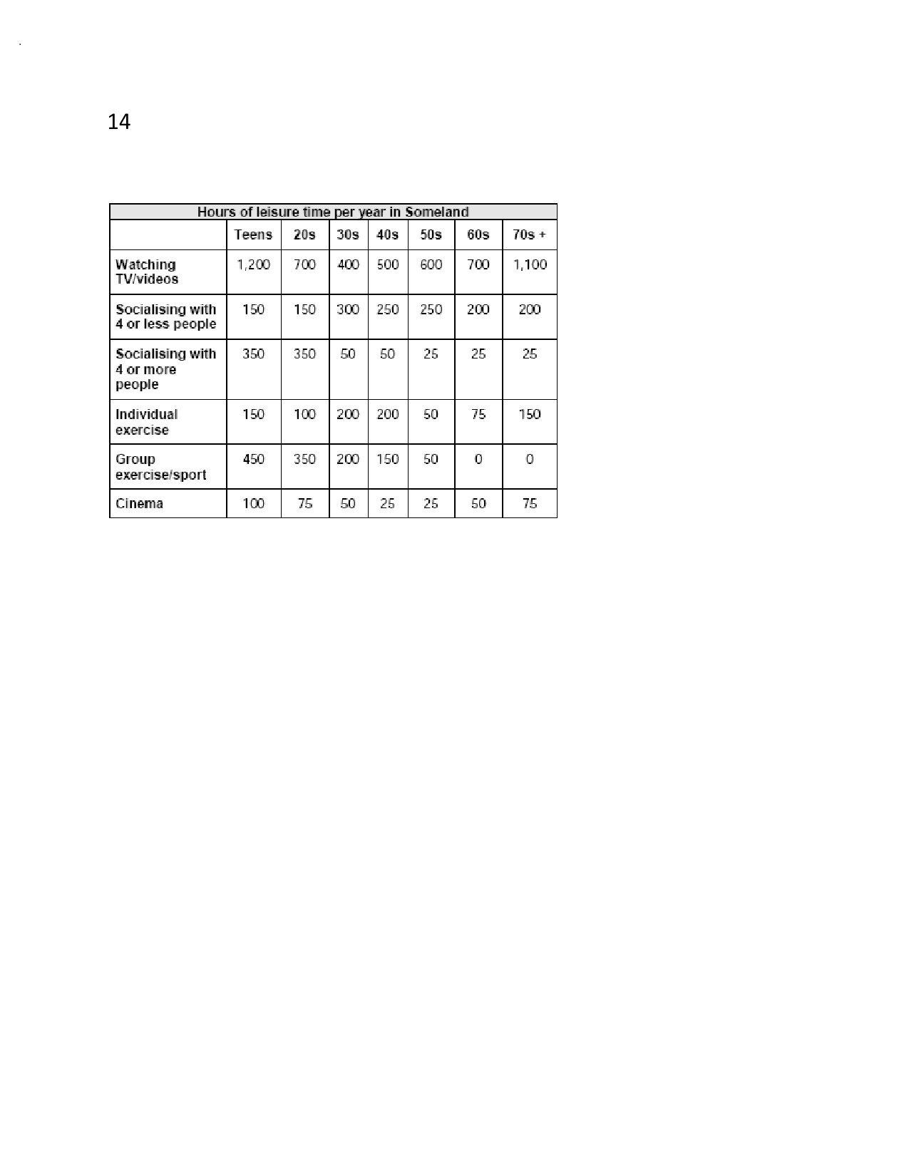
Write a report for a university lecturer describing the information in the table below.
- You should write at least 150 words.
- Allow yourself 20 minutes for this task.

The given table chart describes about the hours of leisure time/ year spend by people of different age groups in Someland. These age groups included teens, people in 20s, 30s, 40s, 50s, 60s and over 70 years of age. The leisure time activities under review are watching T/V videos, socializing with four or less and four or more people, engaged in individual and group exercises and watching cinema.

Turning to detail, the differences in hours per year spend for watching T.V/ videos by teens and people in 70s, 30s and 40s, 40s and 50s, 50s and 60s are only 100hrslyr. Socializing with 4 or less people there are same hours per year spend by people in 40s and 50s (250hrs/yr), 60s and 70s (200hrs/hr), teenagers and 20s (105hrs/yr). In case of socializing with more than 4 people the number of hours among people in 20s and teenagers (350hours/yr), 30s and 40s (50 hours/year), 50s, 60s, and over 70s, 25hours/yr are same.

While considering the hours/yr for individual exercises the same hours are spend by teenagers and people above 70 yrs, 30s and 40s, 200hr/yr. people over 70 yrs and 60s are not interested in group exercises while teenagers are giving the highest concern in this and spending 450hr/yr followed by people in 20s 350hr/yr. Those who are spending time by engaging in watching cinema, the equal numbers of hours can be observed among people of 20s and over 70s, 30s, and 60s, 50hr/yr, 40s and 50s 25hrs/yr.

In short, there were many similarities in spending time for leisure activities in different age groups in the people of Someland.

Write a report for a university lecturer describing the information in the table below.
- You should write at least 150 words.
- Allow yourself 20 minutes for this task.


joythblessy   
Feb 24, 2013
Writing Feedback / (IELTS graph)Japanese tourists &Australia's share of Japanese tourist market [NEW]

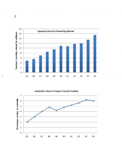
The charts below show the number of Japanese tourists travelling abroad between 1985 and 1995 and Australia's share of the Japanese tourist market.
Write a report for a university lecturer describing the information shown below.
- You should write at least 150 words.
- You should spend about 20 minutes on this task.

The given graphs provide information of Japanese tourists travelling abroad from 1985 to 1995 and Australia's share of Japan's tourism from 1985 to 1994.

At a glance, the Japanese tourists travelling abroad showed a gradual raise during one decade from 1985, with a negligible falls. It reached the peak rate during 1995, nearly 15.5 million. The share of Australia in the Japans share market also followed the same trend. The numbers of Japanese traveled abroad were, only 4.5 million in the year 1985, which showed a gradual steady raise in the following five years until 1990. It declined by 25 million in 1991 and remained roughly constant in the next two years around 12 million. Thereafter it increased remarkably in 1994 and 1995 and reached at its maximum of 15.5 million tourists in the year 1995.

Turning to the second graph, which represents the Australia's share on Japans tourism, from 1985 to1994, showed a sharp increase in its percentage. In 1985, it was only 2%shoot up the next three years and reached around 5% in the year 1988. The next year though it dropped by 1% it regained its popularity, continued the significant growth in the following five years and reached at the maximum level in 1993. Thereafter it declined negligibly at the end of the given period 1994.

In short, Australia's share on Japan's tourism continuously raised and showed an increase of three times after a period of nine years, whereas, Japan's tourists travelled abroad shoot up remarkably by an increase of 11.5 million people after a decade.

The charts below show the number of Japanese tourists travelling abroad between 1985 and 1995 and Australias share of the Japanese tourist market.
Write a report for a university lecturer describing the information shown below.
- You should write at least 150 words.
- You should spend about 20 minutes on this task.


joythblessy   
Feb 23, 2013
Writing Feedback / (IELTS graph) The education levels of women in Someland. [3]

Write a report for a university lecturer describing the information in the two graphs below.
- You should write at least 150 words.
- Allow yourself 20 minutes for this task.

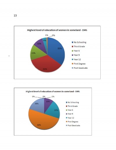
The given pie charts reveal information about the education levels of women in Someland in the years 1945 and 1995. The educational levels includes the percentage of women completed third grade, six years, nine years and twelve years of schooling, first degree, post graduation and no schooling. It is evident that the education level of women increased remarkably in 1995.

In 1975, there were an equal proportion of women who had first degree and not attended the school, which was 35%. Only 15% of women completed their six years in school, whereas, 10% women finished their nine years of schooling. There was only 4% of women was interested to complete their 12yrs of schooling and 1% of women had first degree.

On the contrary, the levels of womens' education shoot up after a period of fifty years, in 1995. Half proportion of the women, 50% completed their first degree. Those who had completed twelve years schooling and post graduation had shared equal proportions of 1/5th of the total, 20%. There was a significant rise in the number of women in these two categories, 16% and 20% respectively. In the same period, the number of women finished their nine years of schooling remained without any change, 10%.

In short, in 1995, the first degree holders percentage showed the highest level of increase 49%, nobody has interested to stop their education after six years of schooling or three degree. After a half century, the awareness of educational importance increased among the women of Someland.

Write a report for a university lecturer describing the information in the two graphs below.
- You should write at least 150 words.
- Allow yourself 20 minutes for this task.


joythblessy   
Feb 22, 2013
Writing Feedback / (IELTS graph)The average hours of unpaid work per week [4]

The diagram below shows the average hours of unpaid work per week done by people in different categories. (Unpaid work refers to such activities as childcare in the home, housework and gardening.)

Describe the information presented below, comparing results for men and women in the categories shown. Suggest reasons for what you see.
- You should write at least 150 words.
- You should spend about 20 minutes on this task.

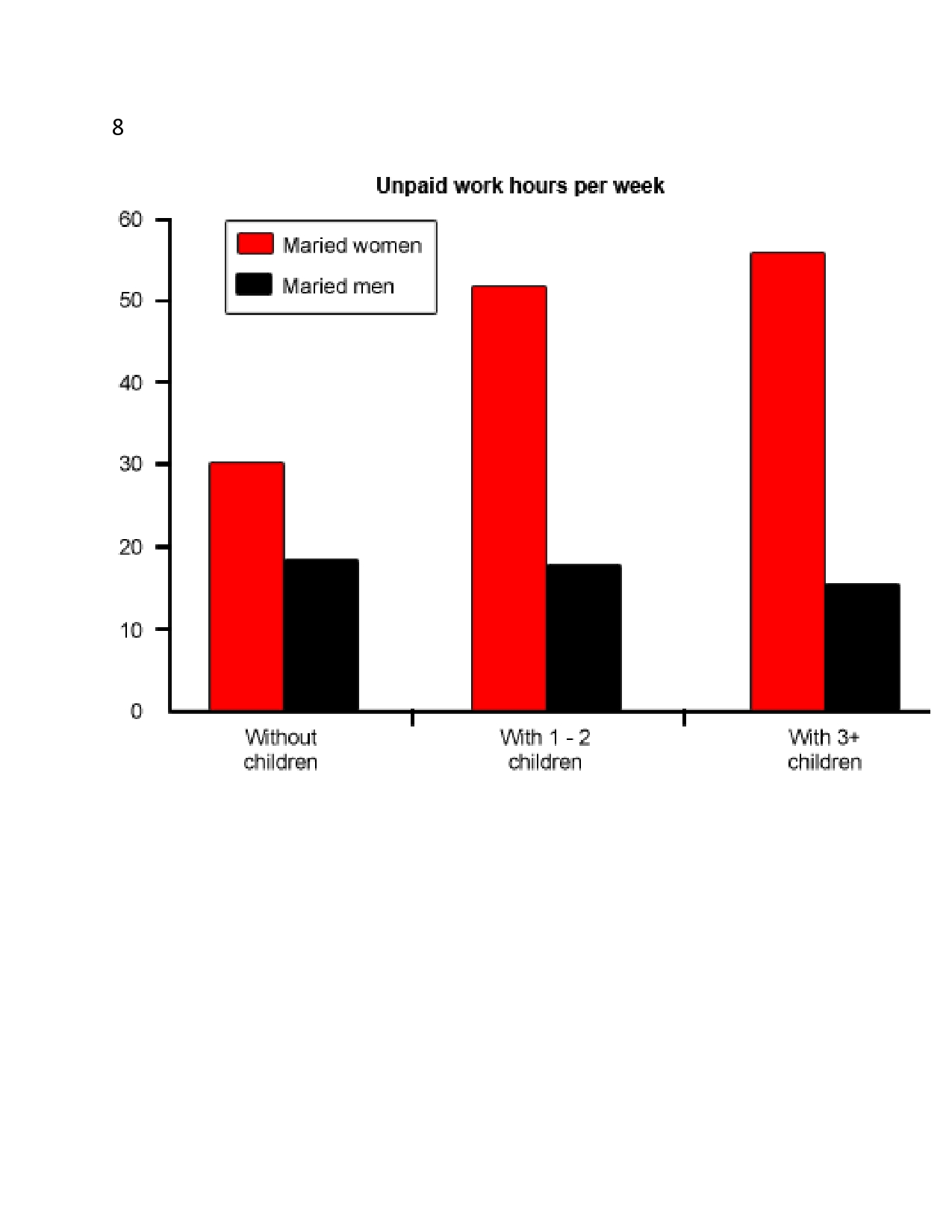
The given chat provides information about the unpaid working hours per week of both married men and women. at a glance, there is a significant rise between the weekly unpaid working hours of married women in these three categories, whereas, the number of unpaid working hours of men in these three categories had no considerable difference.

Turning to detail, the unpaid weekly working hours of married women with 1-2 children and more than 3 children have negligible difference in the unpaid weekly working hours. In case of married women without children are engaged in the unpaid weekly working hours, which accounts roughly near to half of the total working hours of that of married women in another two categories.

Married men without children are sharing unpaid household works, which is only 2/3rd of that of the married women in the same category. Married mothers of 1-2 children are doing nearly 3 times more than the weekly-unpaid hours of married men with 1-2 children. Married fathers of more than 3 children are sharing 1/3rd unpaid working hours weekly than that of mothers with more than 3 children.

In short, the number of children had no remarkable influence on the unpaid weekly working hours of the married men. On the contrary, the number of children had significant influence on the unpaid weekly working hours married women; it is increasing with the number of children.

The diagram below shows the average hours of unpaid work per week done by people in different categories. (Unpaid work refers to such activities as childcare in the home, housework and gardening.)

Describe the information presented below, comparing results for men and women in the categories shown. Suggest reasons for what you see.
- You should write at least 150 words.
- You should spend about 20 minutes on this task.


joythblessy   
Feb 22, 2013
Writing Feedback / IELTS; Why we need music? To keep our mind in peace [6]

Hai Naved...

You have some good points..

Please follow the desired structure of the essay..
Seperate paragraphs...
Write a clear introduction and conclusion..

Tessy
joythblessy   
Feb 22, 2013
Writing Feedback / People resist to CHANGE; Problems & Solutions [4]

Hai Thao...

You have some good points...

Your essay be franck tough to follow..(:

Please seperate the paragraphs with two lines (next line two) it is confusing also..

Minimise the use of i and we,

This is a problem solution question..

Organise your essay..

The problems...
Mention clearly, if possible give example..one after another...

Second body para...

Concentrate on solutions...
Write it clearly, provide example...

Make sure to separate the paragraphs..
I felt like reading a tough literature note..

so organize your essay...
Best wishes..

Tessy
joythblessy   
Feb 21, 2013
Writing Feedback / (IELTS graph)Social and economic indicators for four countries in 1994 [4]

The table below shows social and economic indicators for four countries in 1994, according to United Nations statistics.

Describe the information shown below in your own words. What implications do the indicators have for the countries?
- You should write at least 150 words.
- Allow yourself 20 minutes for this task.

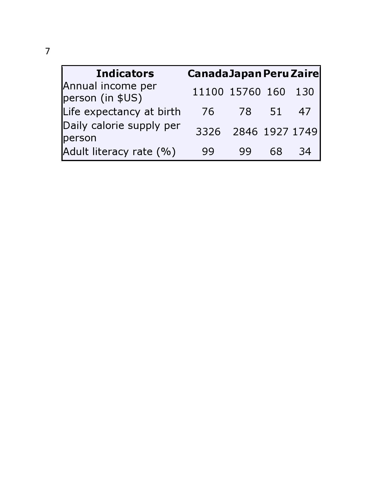
The given table chart illustrates the social and economic indications of Canada, Japan, Peru and Zaire in the year 1994. At a glance, in these four indicators Japan shows the highest level except daily caloric supply per person, whereas Zaire displayed the least in these four countries according to US statistics.

Turning to detail, while comparing Canada and Japan, annual income per person (in $us) Japan showed the highest level, 15760, which is followed by Canada 111000. In life expectancy of the people in these countries there was a negligible difference, at the same time adult literacy rate was same 99%. The caloric supply per person, the difference between the Canada and Japan was only 500.

While comparing Peru and Zaire in all four sectors Peru had high levels than Zaire. The differences between Peru and Zaire in annual per person income is 30$US, Life expectancy at birth was four, daily caloric supply pr person was 178 and adult literacy rate was 50% more.

In short, in developed countries, Japan and Canada all these four categories showed high disparity compared to poor countries Peru and Zaire.

The table below shows social and economic indicators for four countries in 1994, according to United Nations statistics.

Describe the information shown below in your own words. What implications do the indicators have for the countries?
- You should write at least 150 words.
- Allow yourself 20 minutes for this task.


joythblessy   
Feb 20, 2013
Writing Feedback / Technology effects; making friends and communicate with one another is different [5]

Hai willam..
In your essay you should tell how technology effects the types of relation ships people make..
Is it a positive or negative development..

The last body para you can use the reason for your opinion that it is a negative development..
You should organise it. srart the para with your opinion that
I feel it is a negative development. And under this you should mention these negative impacts.

They way effects..
Videocalling..allows people and employers to communicate effectively and reduces the need of travelling.
:Internet calling facillies keep people even from different continents communicate cheaply.strengthen the relationships.
:Social networking medias offer chance to find out our old friends from different places and keep in touch with them.
:Discussing and taking suggestions from different people who have experience in that field give more accurete informations and helps us to make good dicisions.

Tessy
joythblessy   
Feb 20, 2013
Writing Feedback / 'Telecommuting' refers to workers doing their jobs from home- IELTS [4]

Hai Kurian..

I do agree with the two coments of william (empty dusks and relocation of shopping centers)

You can say, fewer employees in the office may adveresly impact the face to face communication with customers.
:Empoyers cannot control the employees because they have limitted contacts with their employees and may effect the quality of the work.
:home offices are helpful for those who have to look after elderly parents or young children.
:give flexibility to employees and they can choose more part time jobs, if they can adjust their time, more income, increased living status.
:reduces air pollution, and associated problems due to the increased number of vehicles on the reoad especially on the peak time.
:can reduce the cost of the employers because there is no need for large offices or accomodation for the employees and can trim down the cost of a product, increase the profit of the employer.

Tessy
joythblessy   
Feb 20, 2013
Writing Feedback / Possible ways to encourage the use of public transport to reduce traffic - IELTS [5]

Hai kurian..

Good essay.. Nice to read..good vocabularies too..

Additional points.

:Encourage public transport system,
:Cheap, on time, reliable public transportations,
:Fee parking or reduction in parking for those who use public transport system such as trains.
:Public education through curriculum and Medias about disadv of personal vehicles.

Tessy
joythblessy   
Feb 20, 2013
Writing Feedback / (IELTS graph)the numbers of workers in 1975 employment sectors of the Freedonia. [4]

You should spend about 20 minutes on this task.
The graphs below show the numbers of male and female workers in 1975 and 1995 in several employment sectors of the republic of Freedonia.

Write a report for a university teacher describing the information shown.
You should write at least 150 words.

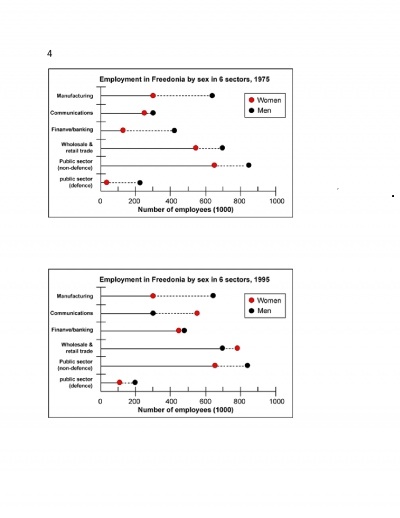
The given chart illustrates the employment in the republic of Freedonia in thousands by both sexes in six sectors in 1975 and 1995. In 1975, the number of man employees excludes the female employees' number in all sectors, whereas after two decades the women employment exceeds men in two sectors, wholesale and retail sector and communications.

In 1975, the public sector (defense), the number of women employment was only 25000 and male employment was 210,000, which was of four folds more than that of female employment. It shows a significant improvement in the female employment in this sector, which increased and became 50% that of the male employment after two decades. In case of employment in finance and banking in 1975 the male employment was four folds than that of the female employment. In 1995, there was a remarkable rise of four folds in female employment and reached at the level roughly equal to the level of the male employments. In communication field there was a negligible difference between the male and female employment in 1975. However, in 1995, the male employment remained the same level while women employment increased double and exceeded the male employment.

In short, the two sectors, manufacturing and public sector (non-defense), the rate of employment in both sexes remained roughly the same in the two years under review. Two sectors, female employment exceeded male employment in 1995.

You should spend about 20 minutes on this task.
The graphs below show the numbers of male and female workers in 1975 and 1995 in several employment sectors of the republic of Freedonia.

Write a report for a university teacher describing the information shown.
You should write at least 150 words.


joythblessy   
Feb 20, 2013
Writing Feedback / (IELTS graph) Typical stages of consumer goods manufacturing [4]

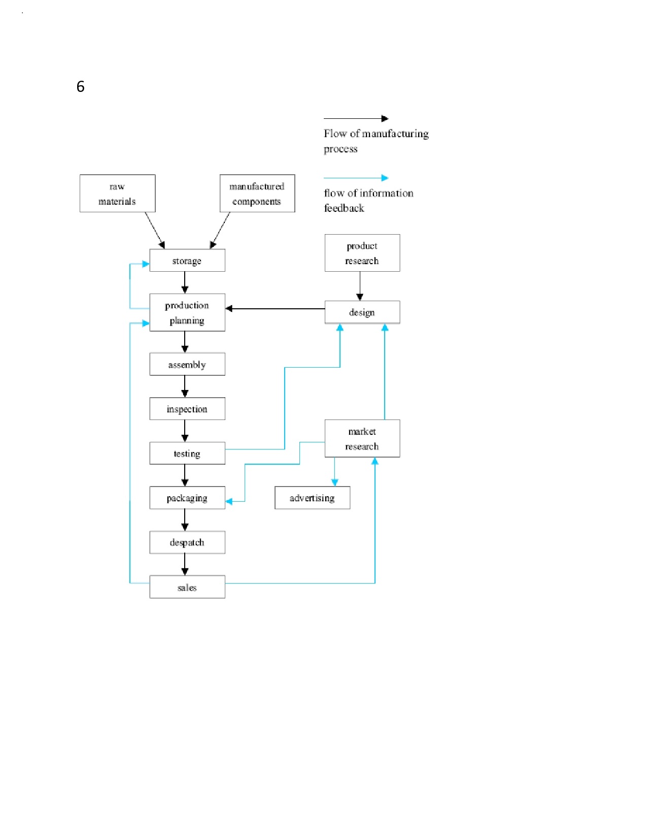
The diagram below shows the typical stages of consumer goods manufacturing, including the process by which information is fed back to earlier stages to enable adjustment.

Write a report for a university lecturer describing the process shown.
- You should write at least 150 words.
- You should spend about 20 minutes on this task.

The given flow chart provides the detailed information about the different stages of consumer goods manufacturing after analyzing the research results.

Raw materials and manufactured products keep in the store room first and then passed to the production planning, assembling respectively. The assembled goods after inspection and testing moved on for packing. The packed items are then ready for distribution in the dispatch section and finally sent for sale.

The research wing does product research and they decide the design of the product. According to the demand, the production also is regulated. The market research done after sales also influences the design of the product and packing. The items are undergoing inspection and testing after assembly. If they need any change in the packing design, they are doing in this stage also. Moreover the planning and design of the goods are depends on the sales. Extra products are stored in the storage room.

In short, the manufacturing of the goods are directly depends on the information feed backs of researches.

Q: Write a report for a university lecturer describing the process shown.
- You should write at least 150 words.
- You should spend about 20 minutes on this task.


joythblessy   
Feb 19, 2013
Writing Feedback / (IELTS) People in the past used to be more dependent on one another [7]

Hai,,willam...

Your introduction you gived your opinion... good...):

It is agree/disagree question...
You can completelly agree with the statement/completelly disagree===>explain the reasons of your agree /disagree in two body paragraphs..no need to explain other side...with examples

You can partially agree with the statement, then you should explain both sides with examples..

So follow this structure while attempting agree/disagree questions...

Tessy
joythblessy   
Feb 18, 2013
Writing Feedback / (IELTS graph) Cinema attendance of different age group of people in Australia [2]

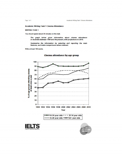
The given chart describes about the cinema attendance of different age group of people in Australia, ten years between 1990 to2010. The age groups included 14 to24 yrs, 25 to 34 yrs, 35 to 49 yrs and above 50 yrs. The group above 50 yrs and 35 to 49yrs showed similar pattern of attendance, where as 25 to 35yrs shows a gradual increase and then decrease and 14 to 24 yrs remained roughly the same with marginal increase.

Turning to detail, the attendance of the age group of above 50yrs and 35 to 49yrs were only 40% and 60% in 1990 respectively, they continued the same level for next year. Then both groups showed a gradual increase though in 1996 above 50yrs showed a negligible drop. Above 50 yrs reached 55% 1998, the same age period 35 to 49yrs remained the same. After the year 2002 both age group's percentage raised significantly and at the end of the ten years both reached at its peak of 60% for above 50yrs and 35 to 49yrs it was 85%.

In case of 25 to 34 yrs, though it started at the level of 60%. It reached at its peak in 2000 and then remained constant for the next six yrs and dropped slowly. At the same time the age group of 14 to 24 yrs started at the level of 90% on 1990, after a minimal drop next year, it regained and reached the second highest position in 1996, 95%. Thereafter, it dropped by next year, and remained constant until 2008. In 2010 it touched it's peak of 98%.


joythblessy   
Feb 18, 2013
Writing Feedback / (IELTS graph) Immigration, Emigration and Net migration in UK. [4]

Hai Dumi and Willam..

Hai Dumi..

Thanks for your suggestions and correction.
The last para is the repetation of the 1st para, and it came by mistake, sorry for the trouble...(

Hai william...
Thanks for the correction.
Tessy..

Writing
Editing Help?
Fill in one of the forms below to get professional help with your assignments:

Graduate Writing / Editing:
GraduateWriter form ◳

Best Essay Service:
CustomPapers form ◳

Excellence in Editing:
Rose Editing ◳

AI-Paper Rewriting:
Robot Rewrite ◳